

The influence of behavioral science on design is well-documented. But unless you are a web designer, you wouldn’t find much material on how the universal principles of behavioral science can be, and are, applied to email design as well.
When was the last time you round-tabled with the creative team on user behavior? Probably never. The creative team is typically left behind as a campaign progresses, their job being to furnish certain set templates, and nothing more.
But, instead of taking your designers’ knowledge and execution of relevant design modules for granted, you may want to get them on board with the dynamics of a live campaign. As campaign manager, you can communicate marketing insights to your creative team, which would involve specific behavioral intelligence.
With over 92K projects delivered, we have seen the value of such an approach up close. Done right, you’re bound to see results.
On that note, let’s see what it looks like in action.
1. The Power of First Impressions
Behavioral science tells us that first impressions are formed within seconds. The same applies to emails—recipients decide whether to open an email based on a few key factors:
- Subject Lines & Preview Text: Concise, intriguing, and benefit-driven subject lines boost open rates. Crafting a compelling subject line requires balancing curiosity, relevance, and urgency.
- Sender Name & Credibility: People are more likely to open an email from a recognizable and trusted sender. Ensure consistency in sender name and email address across campaigns.
- Timing & Frequency: Sending emails at optimal times (e.g., weekday mornings) can improve engagement. Conduct A/B tests to identify the best times for your audience.
The Role of Preheader Text in Hooking Attention
If the subject is vague, the preheader should clarify. If the subject is direct, the preheader should tease more. Ensure the key message isn’t cut off by keeping it between 40-70 characters.
2. Subject Line Optimization
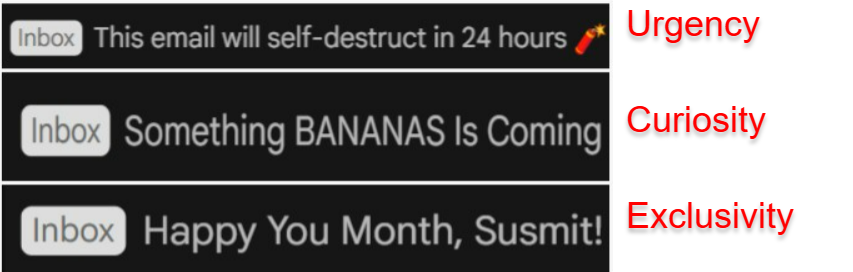
Use psychological triggers like curiosity, urgency, or exclusivity:
- Curiosity – Spark intrigue to encourage opens. For example:
“The Secret to Higher Conversions (Revealed!)” - Urgency – Create time pressure to drive action.
“Your Exclusive Discount Expires in 3 Hours” - Exclusivity – Make readers feel special.
“VIP Invite: Be the First to Try Our New Feature”
You can also combine triggers for greater impact. “This Shocking Deal Ends in 2 Hours—Don’t Miss Out!”
3. Cognitive Load in Email Design
The brain prefers simplicity. Too much information overwhelms readers and leads to cognitive fatigue, causing them to disengage. Here’s how to make your email easier to navigate:
a. Use Clear and Concise Copy
Avoid long paragraphs. Break text into digestible chunks like short paragraphs and bullet points to enhance readability.
Example:
Instead of:
“Our new product line offers a variety of options to help you reach your goals, with sleek designs and features tailored to your needs. You can find several colors and sizes to suit your preferences.”
Try:
“3 Key Benefits of Our New Product Line:
- Tailored features for your needs”
- Sleek design
- Multiple sizes and colors
b. White space is your friend
Cluttered emails are hard to digest. Use white space effectively to give your content room to breathe, and focus attention on key messages.
Example: Apple’s emails often feature clean, minimalist layouts, allowing the focus to stay on the product or call-to-action without distraction.
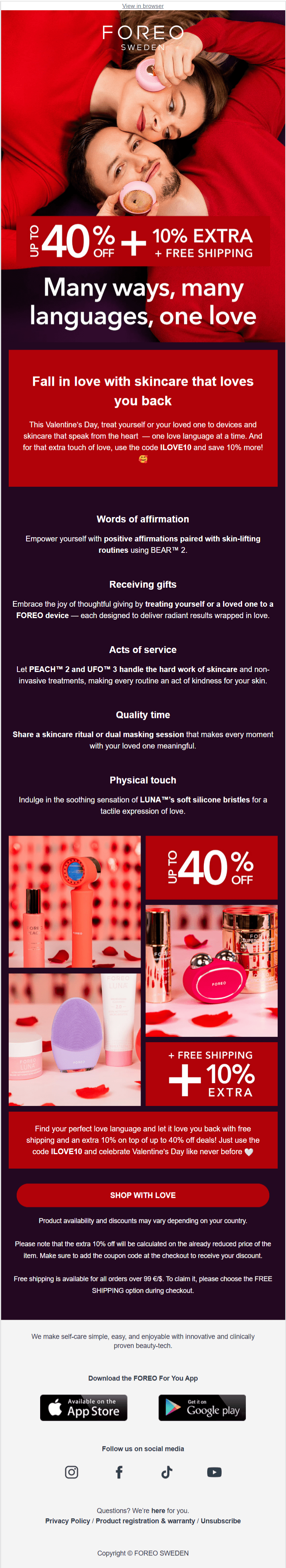
c. Single, clear CTA
Too many competing calls to action (CTAs) confuse readers. Stick to one primary CTA to guide them to the desired action.
Example:
- Instead of multiple CTAs like “Shop Now,” “Learn More,” and “Sign Up Today”
- Use one clear CTA: “Shop Now”
Check out Foreo’s email below which ticks all the boxes.
4. Color & Emotion in Design
Colors deeply influence how we feel and act. By understanding color psychology, you can make your email campaigns more persuasive and engaging.
a. Red: Urgency and Excitement
Red grabs attention and evokes urgency. It’s perfect for limited-time offers or flash sales, motivating quick action.
Example:
- “Last Chance: 50% Off – Hurry, Time’s Running Out!”
- Used in: Flash sale banners and countdown timers.
b. Blue: Trust and Reliability
Blue is calming and instills trust. It’s ideal for industries like finance, healthcare, and tech, where credibility is key.
Example:
- PayPal and banks use blue for their CTAs like “Pay Now” to build confidence.
- It’s often seen in professional emails or forms.
c. Green: Growth and Balance
Green symbolizes growth, balance, and eco-friendliness. It’s perfect for brands focused on sustainability or well-being.
Example:
- “Join Us in Our Green Initiative – Help Save the Planet!”
- Used in: Eco-friendly brands, environmental NGOs, or wellness products.
d. Yellow: Attention-Grabbing
Yellow is bright and attention-grabbing but can be overwhelming if overused. It works best as an accent color to highlight key messages.
Example:
- McDonald’s uses yellow to emphasize “Limited-Time Offer” in their promotions.
- Ideal for callouts, buttons, or banner highlights.
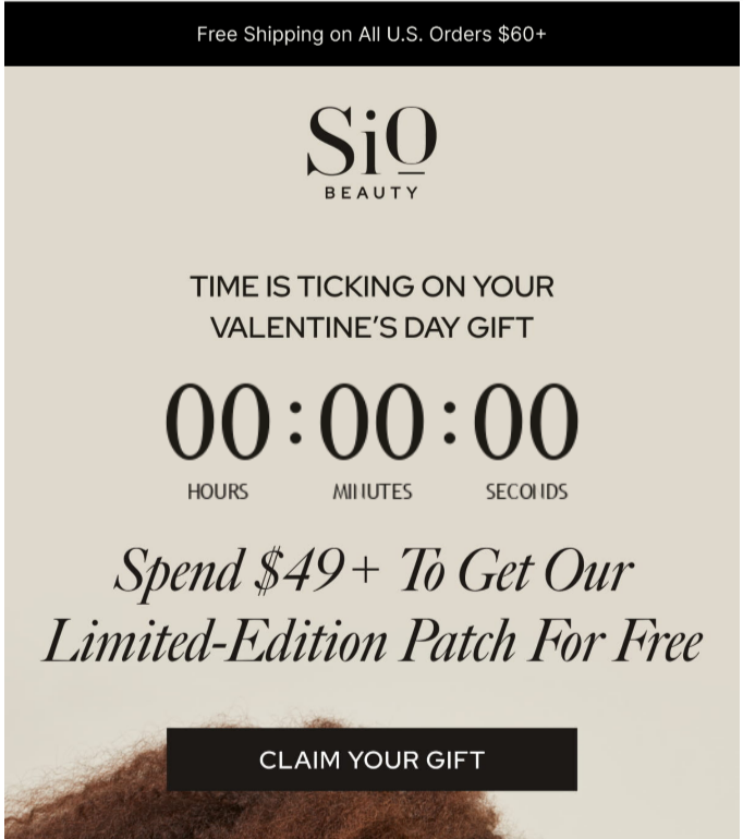
5. The FOMO Effect
Scarcity and urgency influence decision-making. When people fear they might miss out on something valuable, they are more likely to take action.
- Limited-Time Offers: “Only 3 Hours Left!” Example: E-commerce stores use countdown timers.
- Exclusive Access: “Members-Only Preview” Example: Fashion brands like Nike give early access to exclusive sneaker drops.
- Low Stock Alerts: “Hurry! Only 5 Items Left” Example: Amazon highlights stock levels to push purchases.
Here’s how Sio Beauty leverages the FOMO effect.
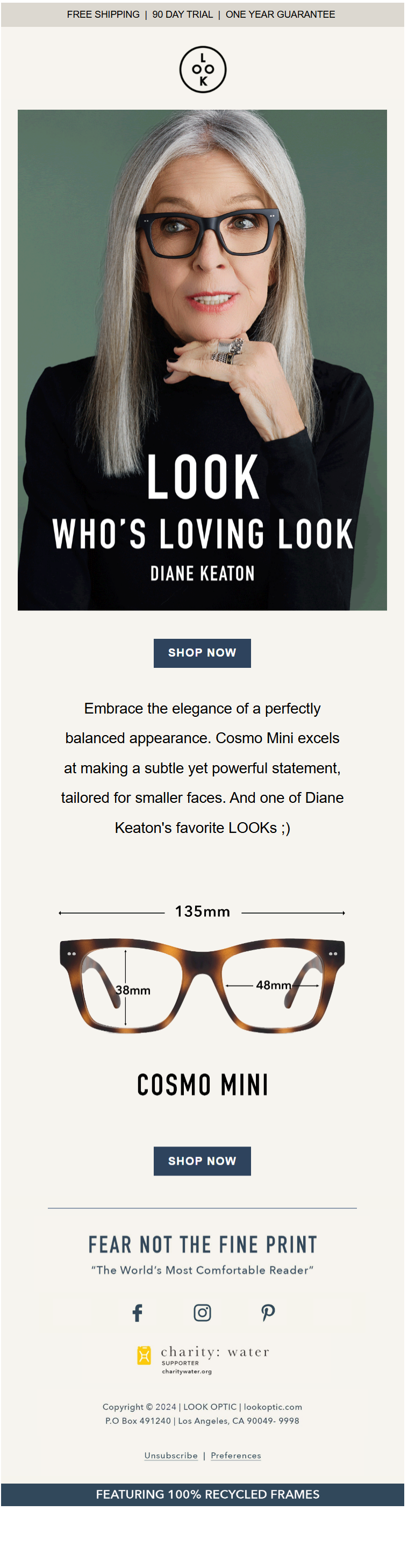
6. Social Proof
People tend to follow the actions of others, especially when uncertain. You can boost credibility and conversions by integrating social proof into your email design:
- Customer Reviews & Testimonials: “See why 10,000+ users love our product!” Example: Software companies like Grammarly showcase testimonials in their onboarding emails.
- User Statistics: “Join 1 Million Happy Subscribers!” Example: Newsletters like The Hustle emphasize their subscriber count to attract new readers.
- Influencer Endorsements: Featuring a trusted figure increases trust. Example: Fitness brands use celebrity trainers to promote products.
Look Optic nails this email which features Diane Keaton.
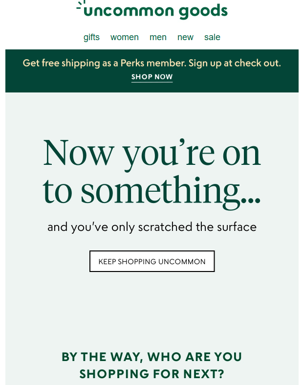
7. Personalization & Relevance
Personalization taps into the brain’s need for relevance. Emails that feel tailored to an individual’s preferences are more likely to drive engagement.
- Use Names: “Hey Sarah, Here’s a Special Offer Just for You!”
- Behavior-Based Segmentation: Ensures relevance by tailoring emails to past actions. Example: E-commerce brands recommend products based on browsing history.
- Exclusive Deals: Offering something valuable for free builds reciprocity (e.g., “Your Free eBook is Inside!”). Example: HubSpot provides free templates in exchange for email signups.
Catch this email from Uncommon Goods. This is an example of behavior-based segmentation.
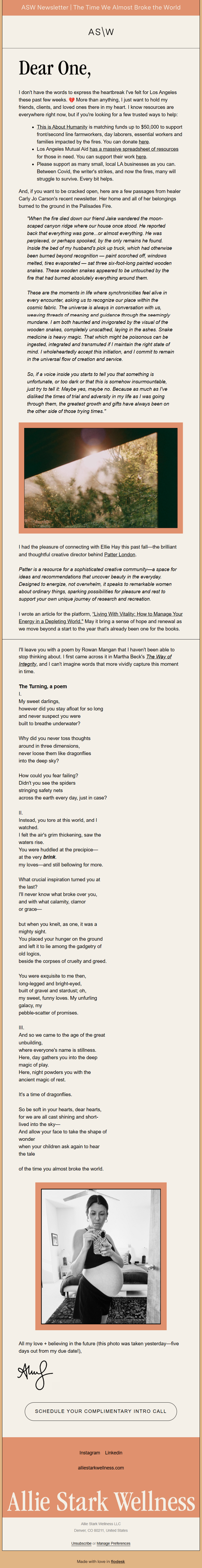
8. Emotional Appeal & Storytelling
Stories create a connection and drive engagement.
- Use psychology-backed messaging to evoke emotions. Example: Charity organizations tell impactful stories to encourage donations.
- Build a narrative around your brand. Example: Nike’s “Just Do It” campaign often includes real-life athlete struggles and triumphs.
Stories create connections and drive engagement by evoking emotions.
Why It Works – People remember stories more than facts. Example: Charities share real struggles to inspire donations.
Emotional Triggers:
Inspiration – Nike’s “Just Do It” shares athlete triumphs.
Empathy – Nonprofits tell beneficiary stories.
FOMO – “Last chance” success stories drive urgency.
How to Use It:
- Present a problem (“John struggled with sleep…”)
- Introduce the solution (“Our tea blend helped…”)
- Show transformation (“Now he wakes up refreshed!”)
- End with a CTA (“Try it today!”)
Use real testimonials, keep it concise, and add visuals for impact.
Allie Stark Wellness does an amazing job with this newsletter.
9. The Ziegarnik Effect
The Zeigarnik Effect states that people remember incomplete tasks better than completed ones. You can use this to encourage action:
- Abandoned Cart Reminders: “You left something in your cart—complete your purchase!” Example: Shopify stores send reminder emails with images of the abandoned items.
- Progress Bars: “You’re 75% done with your profile—finish now!” Example: LinkedIn prompts users to complete their profiles.
- Gamification: “Earn 10 more points to unlock your reward!” Example: Starbucks’ rewards program encourages frequent purchases.
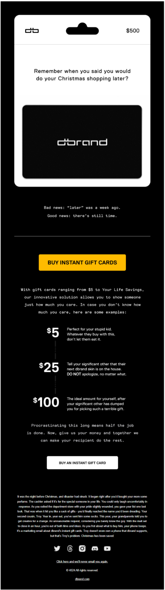
Check out dbrand’s winning cart abandonment email below.
10. The 3-Second Rule
Readers decide whether to engage with an email in under 3 seconds. How can design and messaging influence this?
Primacy Effect:
The first thing a reader sees—like the subject line, sender name, and preheader—has the biggest impact on whether they’ll engage. Make sure these elements are clear, compelling, and relevant.
Example: “Exclusive Offer Just for You!”
Negativity Bias:
People tend to notice errors, inconsistencies, or anything that feels spammy more quickly than they notice positive aspects. Ensure your email design is clean, professional, and error-free.
Example: A broken link or misspelled word could quickly turn a reader off.
Familiarity Principle:
Recognizable branding builds trust and increases engagement. Use consistent logos, colors, and fonts so readers immediately know it’s from you.
Example: Well-known brands (like Apple or Nike) use their distinctive design elements so readers instantly recognize their emails.
How Design and Messaging Influence Engagement
- Clear and Compelling Subject Line: It’s the first thing readers see and needs to grab attention quickly.
- Strong Sender Name: A familiar sender (like your brand) makes the reader more likely to open the email.
- Preheader Text: This brief snippet is your second chance to reinforce your message, giving the reader more reason to engage.
- Mobile Optimization: Ensure your email looks good on mobile since most emails are opened on mobile devices.
Wrapping Up!
By leveraging behavioral science principles, you can craft emails that not only capture attention but also inspire action. Understanding the psychology behind decision-making enables you to optimize every element, from subject lines to CTA- leading to stronger engagement, higher conversions, and more impactful email marketing campaigns. Settling for good or great email designs? Get in touch with our email design team if you want the latter.