

Ignoring Dark Mode? You’re not just restricting, but may be messing with inbox experience, as well. Missing brand logos, invisible text, inverted colors — these are just some of the issues in emails not optimized for Dark Mode. You might as well be sending out “email negatives,” so to speak.
In the midst of an attention recession, brand opacity is the last thing you need.
Just a simple toggle can cock up your designs. Take stock of your send-preparedness before it’s too late.
Let’s size up some typical Dark Mode challenges, and learn how to overcome them.
Common Dark Mode Email Challenges
1. Color Inversion
Color inversion is a sore thumb, a predominant Dark Mode email issue. The switch from dark to light or light to dark can ruin your email in these ways:
- Inversion can completely change your original color scheme, affecting your brand identity.
- Important text, navbars, and CTA buttons can disappear.
- Aesthetic elements, such as drop-shadows, can also be wiped out in Dark Mode.
For example, consider the Light and Dark versions of this email from no less than Neiman Marcus.

Nav bar gone! Product names and descriptions gone!
For Neiman Marcus to be ignorant about Dark Mode is quite an illumination. But the question is, how to prevent color inversion in emails?
Our email design team recommends these email color inversion fixes:
- Create sufficient contrast between text and background color to ensure legibility in Dark Mode.
- Avoid pure white as it can come off as being too lurid.
- Be careful about using effects like drop-shadows. If you insist on keeping shadows, using a lighter shade of the background color might do the trick. But generally, avoid shadows.
- Add outlines around icons so they’re visible in Dark Mode.
- Be careful about using color gradients. Dark Mode tends to obscure visual depth and shade distinctions.
2. Missing Logo
The logo is the chief design element of your brand identity.
But if your emails are not optimized for Dark Mode viewing, the logo can disappear, leaving subscribers confused. Imagine sending a logo-less welcome email to a new subscriber who views emails in Dark Mode; or even in the case of a double opt-in, where the subscriber is giving their consent a second time, the absence of a logo can raise suspicions in what is practically a trust zone!
Take a look at this email from Macy’s for some perspective. The stakes are high, as you can understand.

So, what’s the solution? Here are a few core recommendations:
- Use transparent PNGs to ensure that no white box appears around the logo.
- When your logo or logo text color doesn’t go well with dark backgrounds, they’ll become indistinguishable. To prevent that, consider adding strokes, white/glow lines to the logo so that it’s visible and readable. Drop shadows work too.
- Use a header graphic for your logo so that, light or dark, it’ll remain unaffected by the different environments.
- Add a gradient behind the logo.
- Use a dark color scheme. It’s quite the trend these days, and such templates work in light as well dark environments.
You can also create a separate Dark Mode version of your logo so that it is displayed according to the mode in operation.
For that, you’ll need to use the following code snippet.
/* Default styles */
.dark-mode-hide {
    display: block; /* Default to block */
}
.dark-mode-show {
    display: none; /* Default to none */
}
/* Media query for Dark Mode */
@media (prefers-color-scheme: dark) {
    .dark-mode-hide {
        display: none !important; /* Hide in dark mode */
    }
    .dark-mode-show {
        display: block !important; /* Show in dark mode */
    }
}
Related post: 16 Overlooked Email Development Challenges That Marketers Must Address

3. Accessibility Issues
All the previous challenges were related to accessibility alright. In this section though, you’ll learn how Dark Mode can disrupt the viewing experience for differently-abled subscribers.
Dark Mode can affect such viewers in the following ways:
- Low contrasts require viewers to strain their eyes in order to make out a piece of content.
- Poor font weight can make text hard to scan.
- Use of stark white can hurt people with visual impairments.
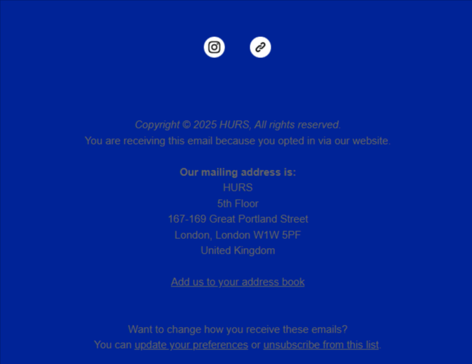
Speaking of low contrasts, check out the footer of this email from HURS. The color combination is wide of the mark.
Interestingly, improved accessibility is one of the leading reasons why users prefer Dark Mode. As Tanner Kohler and Amy Zang at Nielsen Norman Group point out, “Aesthetic appeal and improved accessibility are the strongest arguments for supporting dark mode.” So, here’s how you can optimize for accessibility:
- Be careful about the contrast ratio. You want to make sure it meets the WCAG recommendations.
- Use cleaner, larger fonts to maximize readability.
- Test to make sure that Dark Mode versions don’t hinder the functionality of screen readers.
Related post: Image-only vs Image-also: Email’s Image Issues In Focus
4. Client Compatibility
No points for guessing that email rendering in Dark Mode has its peculiar challenges.
As Justin Khoo, founder of ProofJump, explains, “Although the Gmail client for iOS does a “full invert” in colors, clients, such as Gmail for Android as well as Outlook and the native iOS Mail clients, only do selective color inversion. Generally, clients that do selective color inversion will only make light background colors darker while making dark text lighter and not vice versa. With selective color inversion, you may sometimes end up with the client converting a light background to a dark color while not converting the text within, to a light color, rendering the email unreadable.”
You can find out how different email clients treat Dark Mode in the following table.
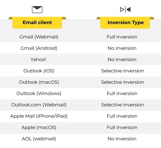
You can view the comprehensive list on Can I email. But how to ensure Dark Mode compatibility in emails?
The first step is to make sure that your email works in both Light Mode and Dark Mode. The code snippet below does that.
<meta name="color-scheme" content="dark light">
<meta name="supported-color-schemes" content="dark light">
Now, the following snippet of code uses media queries to ensure that the design adapts to light and dark as and when needed.
@media (prefers-color-scheme: dark) {
      body {
          background-color: #000000; /* Dark background */
          color: #ffffff; /* Light text */
      }
  }
Now, here are some general recommendations:
- Start with Dark Mode in mind, instead of waiting for emails to look messed-up and only then looking for fixes.
- Prioritize Dark Mode optimization for as many clients that support it as possible. Gradually, via previews, test where you can leverage advanced techniques.
- Don’t forget to add fallback versions.
- Test all emails thoroughly. Email on Acid and Litmus have been our go-to tools for email testing.
The stand-out best-practice would be testing all your templates in Light and Dark Mode. Test extensively. Test again and again. Use tools like Litmus and Email on Acid to fast-track tests. Whether to fix Dark Mode email colors or to resolve compatibility issues, testing alone can help you to send out emails with confidence.

Need Help with Dark Mode in Emails?
Get a peek into how we at Email Mavlers audit email templates. We evaluate critical elements such as design consistency, mobile responsiveness, pre-header text, and ESP integration. Our insights help boost email performance, enhancing open rates, click-through rates, and overall engagement. Share your email address, and get our FREE audit report.