

Drag-and-drop email builders have revolutionized email design, allowing marketers to create visually appealing emails without needing to code. However, a common issue arises with content block width mismatches, where blocks appear inconsistent across different email clients, affecting layout, responsiveness, and the overall design integrity.
Today’s blog post explores the causes of these mismatches, their impact, and actionable solutions with real-world examples.

Understanding Email Content Width Mismatch
A content block width mismatch occurs when the width of email sections differs unexpectedly across different email clients and devices. This can lead to broken layouts, overlapping content, or excessive white space, diminishing user experience and engagement.
Common causes of email content width mismatches include:
- ESP-Specific Rendering Rules: Each email service provider (ESP) has unique rendering guidelines that can alter the appearance of content blocks.
- Padding and Margins: Inconsistent padding and margin settings can create unintended gaps or overlaps.
- Non-Responsive Blocks: Some drag-and-drop editors generate fixed-width elements that don’t adjust well to different screen sizes.
- Hybrid Coding vs. Default Builder Code: Some builders use hybrid coding techniques that conflict with default HTML styling.
- Outlook-Specific Issues: Microsoft Outlook, particularly older versions, applies its own rules, often ignoring max-width settings.
Related: 16 Overlooked Email Development Challenges
Impact of Email Template Width Problems on Email Performance
Broken layouts, if occurring repeatedly, will lead to:
- Inconsistent Branding: Broken emails may not align with brand guidelines due to unexpected width changes.
- Reduced Readability: Misaligned text and images can make content harder to read, leading to lower engagement rates.
- Poor Mobile Experience: Non-responsive content blocks can appear too wide or too narrow on mobile devices, frustrating users.
- Decreased Conversion Rates: A broken layout can negatively impact CTAs, reducing conversions and click-through rates.
How to Fix Content Block Alignment Issues
Let’s consider some of the proven ways to fix content block alignment issues:
- Use a Consistent Width Standard
Set a standard width (typically 600px) for your email layout to ensure consistency across devices. Many ESPs default to this width, minimizing discrepancies.
.email-container {
            width: 600px;
            margin: 0 auto;
            background-color: #ffffff;
border: 1px solid #dddddd;- Manually Adjust Padding & Margins
Avoid setting extreme padding values (such as, over 40px) as different clients interpret them differently.
Instead of using multiple layers of padding/margins, define a uniform spacing rule at the block level.
.content-block {
        margin-bottom: 20px; /* Uniform spacing between blocks */
        padding: 10px; /* Consistent padding within each block */
background-color: #f9f9f9;- Leverage Fluid Design for Responsiveness
Use percentage-based widths instead of fixed pixel values (e.g., width: 100% instead of width: 600px).
Apply max-width and min-width properties to ensure a flexible layout.
<style>
    .email-container {
        width: 100%; /* Use percentage-based width */
        max-width: 600px; /* Set maximum width */
        min-width: 320px; /* Set minimum width */
        margin: 0 auto; /* Center the container */
        background-color: #ffffff;
        padding: 20px;
    }
</style>- Avoid Nesting Too Many Tables
Excessive nested tables can cause misalignment issues. Instead, opt for a simple table structure with clearly defined widths.
  </style>
<table class="simple-table">
    <thead>
        <tr>
            <th>Header 1</th>
            <th>Header 2</th>
        </tr>
    </thead>
    <tbody>
        <tr>
            <td>Row 1, Cell 1</td>
            <td>Row 1, Cell 2</td>
        </tr>
        <tr>
            <td>Row 2, Cell 1</td>
            <td>Row 2, Cell 2</td>
        </tr>
    </tbody>
</table>- Enable Custom CSS Overrides
Some email builders allow custom CSS overrides. Utilize this feature to apply media queries for better mobile responsiveness. For example:
@media screen and (max-width: 480px) {
  .container {
    width: 100% !important;
  }
}- Test Emails in Multiple Clients
Use testing tools such as Litmus, Email on Acid, or built-in ESP preview features. Make sure to check emails in Outlook, Gmail, Apple Mail, and mobile clients to ensure proper width rendering.
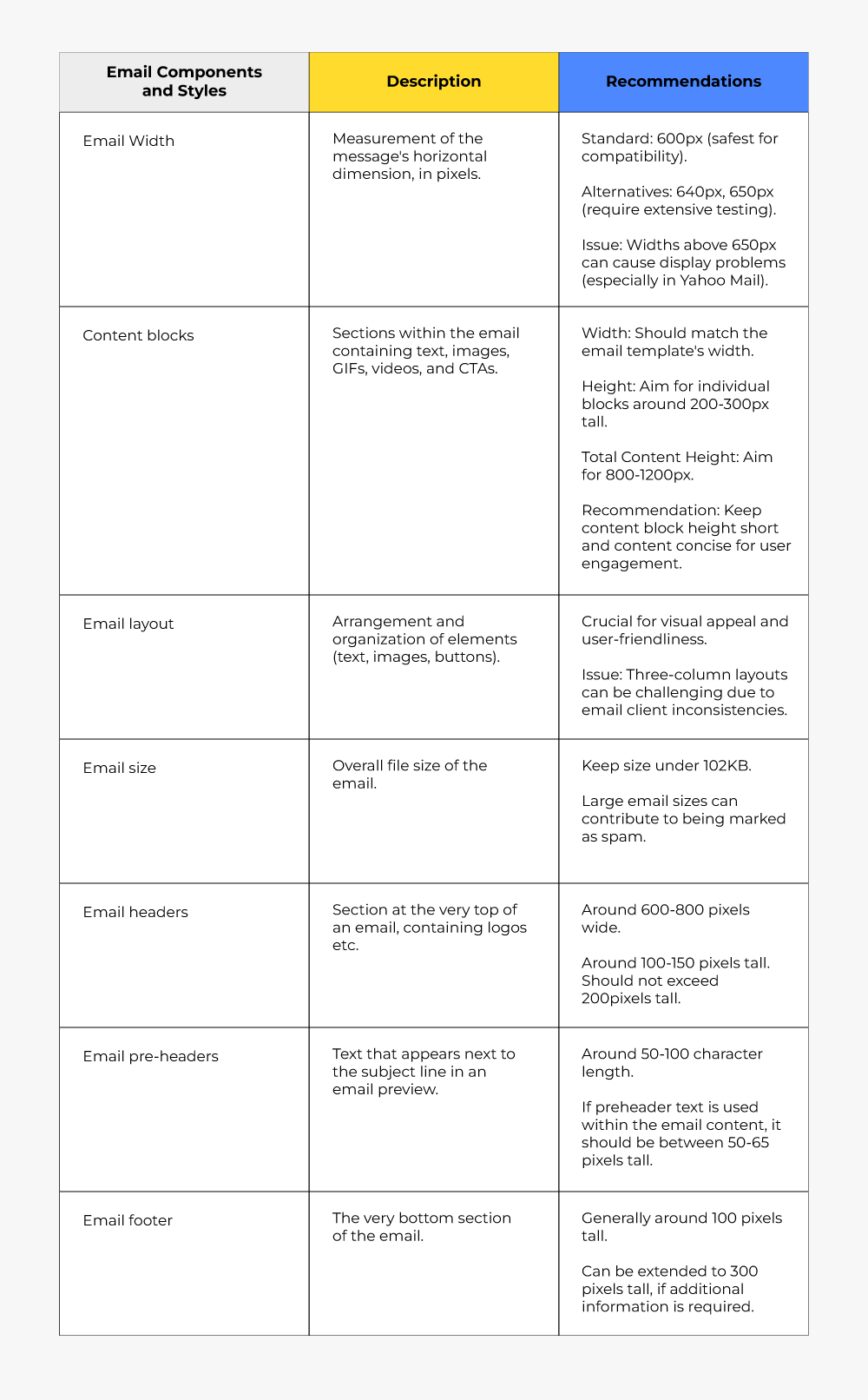
Refer to the below table for general and specific recommendations with respect to email formatting.
Real-world ESP-specific Scenarios
Below we list a few ESP-specific email block width scenarios we’ve come across in our work with clients.
- Fixing a Column Width Issue in Mailchimp
A client’s Mailchimp email had a three-column section where the third column appeared narrower than the others in Outlook.
Our developer adjusted the column widths using percentage values in place of fixed pixels. We used Mailchimp’s built-in structure blocks to enforce even spacing. And, following the usual best practice, we applied conditional comments for Outlook-specific width fixes.
Related: Templates Not Loading in Gmail? Here’s the Fix!
- Overcoming a Width Collapse in HubSpot
A HubSpot email’s two-column layout collapsed into a single column on mobile, but appeared misaligned on desktop.
The first thing we did was we implemented max-width: 100% for all content blocks. We then removed excess padding and used box-sizing: border-box to maintain structure. Finally, we added media queries to explicitly define column widths on smaller screens.
Related: HubSpot Template Editors: A Top-level Overview by Our Expert
- Resolving a Full-Width Image Issue in Klaviyo
A client’s email featured a banner image that appeared full-width on desktop but was cropped on mobile.

To begin with, we used width: 100% and max-width: 600px for image responsiveness. Then, we ensured that the image tag included display: block to prevent unwanted spacing.
We closed it by adding an inline style attribute within the <img> tag to enforce proper scaling across different email clients.
- Fixing Button Alignment in Pardot
A CTA button appeared off-center in Gmail but looked fine in Outlook.

We used table-based button formatting instead of relying solely on <div> or <span>. And we applied text-align: center within the parent table cell to enforce alignment consistency. Also added extra padding around the button to ensure proper spacing.
- Adjusting Multi-Column Layout in Salesforce Marketing Cloud
A three-column layout in Salesforce Marketing Cloud stacked unevenly on smaller screens, causing elements to shift unexpectedly.
First, we applied display: inline-block for each column to maintain their side-by-side positioning. And then we used vertical-align: top to prevent columns from misaligning when wrapping. And the last step was just about implementing media queries to define explicit widths for small screens in order to ensure a balanced layout.

Content block width mismatches can be frustrating, but with careful planning and implementation, they can be mitigated effectively. By maintaining consistent width standards, optimizing for responsiveness, and testing across multiple clients, email marketers can ensure their designs remain visually appealing and functional across all devices.
Need help with designing customizable email templates? Let’s shake on it!
Divya S - Subject Matter Expert (SME)
Ravindra Patel - Subject Matter Expert (SME)
Susmit Panda - Content writer