

Email development can seem like rocket science. Blame it on email clients.
Most email environments are like the flesh-melting atmospheres on far-off planets—only carefully built, well-equipped, and thoroughly tested emails can handle them. (Outlook scalds every email within its orbit!) Honestly, the gap between a web developer and an email developer is kind of like the difference between a pilot and a fully automated space shuttle.
If you’re scratching your head over broken emails, join the club! A fair bit of our 12-year run developing emails has involved head-scratching.
There are multiple modules and frameworks for creating responsive emails. In today’s guide, our experts talk about the use of Flexbox in emails.
Like anything related to email development, Flexbox, which is mostly used by web developers, also has its pros and cons, mostly cons.
However, one may still utilize it—as we have a number of times—to break stalemates otherwise untouchable. Well, let’s find out today.

What is Flexbox?
In terms of email design, Flexbox can be defined as a tool which allows you to control and manipulate email layouts.
With Flexbox, you can build complex yet responsive layouts.
Without media queries.
So instead of relying on breakpoints defined by media queries, Flexbox, being inherently responsive, adapts the layout based on available space.
Take a look at the following Flex layout. Just keep in mind that items are laid out either along the main axis or the cross-axis.
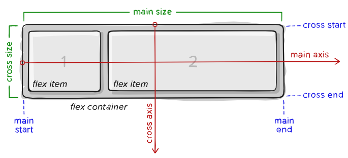
The basic principle of Flexbox revolves around the relationship of the “parent” element and the “child” element. Properties applied on the parent element will have certain effects on the child element. This is the crux.
Now, what does coding emails with Flexbox look like?
Consider the below code snippet which is used to achieve perfect centering. (The snippet is supplied by Chris Coyier of CSS-Tricks.)
.parent {
  display: flex;
  height: 300px; /* Or whatever */
}

.child {
  width: 100px;  /* Or whatever */
  height: 100px; /* Or whatever */
  margin: auto;  /* Magic! */
}
The display:flex turns the element with the class parent into a flex container.
Consequently, the elements within the child element become flex items.
The margin set to auto ensures that any extra space within the container is equally distributed on all sides of an item’s margin.
Now, go back to the Flex layout above where the main axis and cross axis, along which items will be laid out, are shown. margin: auto; will push the child element toward the center horizontally and vertically. Perfect centering.
Key Concepts & Terminology
A. Flexbox Layout
Flexbox is a CSS layout model designed to provide space distribution between items in a container, even when their size is unknown or dynamic. This model offers an easy way to align items, distribute space, and create flexible layouts.
- Main Axis: Defines the direction in which the flex items are laid out (horizontal by default).
- Cross Axis: Perpendicular to the main axis (vertical by default).
B. Responsive Email Design
Responsive email design involves creating emails that adapt to various screen sizes. This ensures the email layout remains functional and visually appealing on both large (desktop) and small (mobile) screens.
C. Media Queries
Media queries in CSS enable the application of different styles for different screen sizes and device orientations. They are vital for making emails look good on both desktop and mobile devices.

Why Flexbox? Understanding A Flexbox Email Template
Flexbox is used to structure the layout. It allows you to easily center content, align items flexibly, and make adjustments without relying on floats or positioning. We use flex-direction: column to stack content vertically, which is ideal for email layouts. The layout is inherently flexible, and the elements will resize properly on mobile devices thanks to the max-width on .email-wrapper and the media query.
Here are some of the advantages of Flexbox with respect to email templates:
- Flexibility: Flexbox allows items within a container to grow, shrink, or remain fixed based on the available space. This makes it easier to create layouts that adjust dynamically to screen size.
- Simplified Alignment: Aligning items vertically or horizontally within a container is much simpler than using older layout methods like floats or inline-block.
- Mobile Optimization: Flexbox works well on small screen sizes and provides better control over item resizing.
- No Table Dependencies: Traditional email layouts depend on <table> elements for alignment and positioning. Flexbox eliminates the need for nested tables, so codes are cleaner and more manageable.
- Maintaining Layout Integrity: Flexbox maintains consistency in layouts across screen sizes, reducing the scope of layout breaks.
Now let’s take the case of a simple CTA button. Take a look at this image.
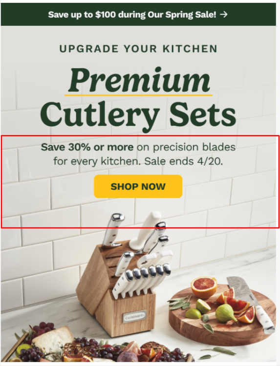
Consider our earlier example of perfect centering. In the above template, the highlighted block is a container.
Now, you can think of the container as the parent and the button as the child.
The code that we shared instructs the container i.e. the parent to arrange the CTA button i.e. the child as per available space.
The display:flex makes the container flexible in how it arranges the elements within the box.
But let’s consider another example of a newsletter welcome campaign. This is a test email (mobile view) our team developed.
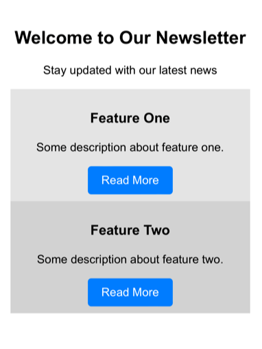
Here’s the entire code for the test email.
<!DOCTYPE html>
<html>
<head>
    <meta http-equiv="Content-Type" content="text/html; charset=UTF-8">
    <meta name="viewport" content="width=device-width, initial-scale=1">
    <title>Responsive Email with Flexbox</title>
    <style>
        body {
            font-family: Arial, sans-serif;
            margin: 0;
            padding: 0;
            background-color: #f4f4f4;
        }

        .container {
            max-width: 600px;
            margin: auto;
            background-color: #ffffff;
            padding: 20px;
        }

        .flex-container {
            display: flex;
            flex-wrap: wrap;
            justify-content: space-between;
        }

        .column {
            flex: 1;
            min-width: 250px; /* Ensures responsiveness */
            padding: 10px;
        }

        .button {
            background-color: #007bff;
            color: white;
            padding: 10px 20px;
            text-decoration: none;
            border-radius: 5px;
            display: inline-block;
        }

        @media screen and (max-width: 600px) {
            .flex-container {
                align-items: center;
            }

            .column {
                width: 100%;
                text-align: center;
            }
        }
    </style>
</head>
<body>
    <div class="container">
        <h2 style="text-align: center;">Welcome to Our Newsletter</h2>
        <p style="text-align: center;">Stay updated with our latest news</p>
        <div class="flex-container">
            <div class="column" style="background-color: #e3e3e3;">
                <h3>Feature One</h3>
                <p>Some description about feature one.</p>
                <a href="#" class="button">Read More</a>
            </div>
            <div class="column" style="background-color: #d1d1d1;">
                <h3>Feature Two</h3>
                <p>Some description about feature two.</p>
                <a href="#" class="button">Read More</a>
            </div>
        </div>
    </div>
</body>
</html>
You don’t have to understand the entire code. The principal driving force, like we’ve said already, is the relationship between parent and child.
So in the above code, .flex-container is the parent and its properties control how the children or items are laid out, that’s all. And the properties applied to .column determine how the items behave within the container.
Speaking of properties, now is a good time to take a look at the key properties in Flexbox.
Key Properties in Flexbox
Let’s consider the container properties and item properties in Flexbox.
1. Container properties (applied to the parent element)
Common container properties in Flexbox include the following:
- display: flex – This property turns an element into a flex container, enabling Flexbox for its children.
- flex:direction – Defines the direction of flex items inside the container.
- flex-wrap – Controls whether items should wrap onto multiple lines if they don’t fit in a single line.
- justify-content – Aligns items along the main axis (horizontal, if flex-direction: row).
- align-content – Aligns multiple lines of items along the cross axis (for multi-line flex containers).
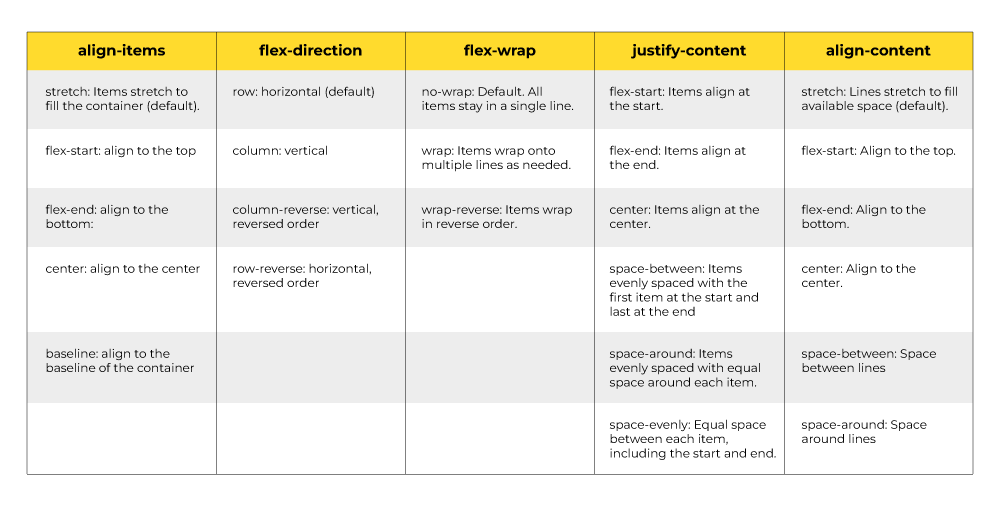
Next, let’s take a look at the item properties which are applied to the child.
2. Item properties (applied to the child element)
Common item properties in Flexbox include the following:
- flex-grow – Defines how much a flex item will grow relative to other items. Default: 0 (item doesn’t grow).
- flex-shrink – Defines how much a flex item will shrink if the container is too small. Default: 1
- flex-basis – Defines the initial size of the item before any growing or shrinking occurs. Default: auto
- flex – A shorthand for all the above properties.
- align-self – This property allows a flex item to override the container’s align-items setting and align itself individually.
It is important to keep in mind that with respect to email design, Flexbox is up against a few challenges due to limited client support.
Therefore, you’ll need to apply certain best practices in order to make Flexbox layouts work in email. But first, let’s look at the limitations.
Limitations of Flexbox in Email Design
1. Limited support
While Flexbox is widely supported in modern browsers, older email clients (especially some versions of Outlook) may not fully support Flexbox. In such cases, developers might need to use fallback techniques.
Speaking of clients, these email clients support Flexbox:
- Apple Mail (mac-OS and iOS)
- Android Default Email Application (Android 4.4 and below)
- Outlook App (iOS and Android)
- Thunderbird 31 (and above)
- Samsung Email (Android)
Gmail, Outlook.com, and Office 365 filter out most flexbox properties, except display:flex. Yahoo! Mail and AOL offer limited to no support.
2. Complex Nested Elements
Flexbox is great for one-dimensional layouts (either row or column). However, creating complex multi-dimensional layouts (e.g., nested grids) can be challenging—especially when trying to ensure compatibility with all email clients. As with traditional email coding, simplicity is key in Flexbox, which forces developers to return to table-based layouts.
3. Poor Handling of Dynamic Content
Flexbox can disrupt the layouts of dynamic-enabled emails.
For example, in a personalized discount offer, two subscribers may receive the same email with different discount values. However, varying data lengths can disrupt the layout, making simple number changes insufficient.
This shouldn’t be a problem in the case of traditional CSS. Even if it is, testing would flag it, and developers can fix it.
4. Complex Debugging
Owing to inconsistent support across email clients, debugging becomes very hard—unlike in the case of web browsers.
Best Practices for Using Flexbox in Emails
Below are a few best practices for using flexbox in email design:
- Wrap the entire email content inside a container (e.g., .email-wrapper) to control its maximum width and centering so that the email doesn’t stretch too wide on larger screens.
- Start by designing for smaller screens first, and then progressively enhance the layout for larger screens using media queries.
- Always define a max-width for your email. A typical max width is around 600px. This also prevents emails from stretching too wide.
- Emails should be visually appealing yet simple. So avoid heavy images, complex JavaScript, or interactions that might break in email clients.
- Flexbox is most effective when widths are set in percentages rather than fixed pixel values, allowing the layout to scale more naturally across screen sizes.
- Always test your email in multiple email clients(e.g., Gmail, Outlook, Apple Mail) and on different devices (smartphones, tablets, desktops).
At Email Mavlers, we test all our emails on Email on Acid and Litmus.

Wrapping Up!
Flexbox is tempting, but problematic in emails. Our recommendation would be to approach it very cautiously. Support for modern CSS like Flexbox will likely increase in the near-future. Apple Mail on iOS 9, for example, supports @supports declarations, which does allow the use of order property to reorder elements visually, notwithstanding the base order in the HTML code.
But till then, one would do best to stick to the time-tested best practices; like it or not, it isn’t exactly Space Age for emails as yet.
Need help with email development? Talk to our email scientists today!
Nikeeta Chougule
Boaz Abraham - Subject Matter Expert (SME)
Susmit Panda - Content writer