

The noise around all-image emails is not new. It’s always been a bone of contention among marketers and brands.
Which explains the recent crop of blog articles on the subject.
It’s the eternal dialectic between form and function. You want to send out accessible as well as beautiful emails.
As horse-sensible as that sounds, not all brands adhere to it. Are you a fashion brand? Ten to one, you send out image-only emails. The compulsion is real. But, when you zoom in on your analytics—let’s be honest!—the practice seems unjustified.
Whatever your niche, our subject matter expert deals with it once and for all. Stay put while we get started.
The Lie Called ‘Visually Appealing Emails’
As strange as that sounds, it’s actually true.
Make no mistake, it’s NOT the intention to create visually appealing emails that’s being questioned. If you rely heavily on product images, you do want to design HTML-rich, visual emails.
However, email being what it is, you’ll need to tread carefully:
- Images might not be displayed for many recipients thanks to the image being blocked by the email client’s default setting or the subscribers’ personal preferences. As a result, your well-designed email could end up looking like a “white block of nothing.”
- Image-only emails can set off spam filters when they include big files or don’t have proper alt text.
- Slow load times on mobile networks further delay the display of large images which take a lot of time to load.
- Tracking via text is easier. Marketers can include links within the messages, monitor the number of views, and even ascertain the level of interaction recipients have had with the content. However, all-images do not have such capabilities, and as such, you won’t be able to gain useful insights into user behaviour.
- All-image emails don’t work on screen readers because the latter can’t explain what’s in the images.
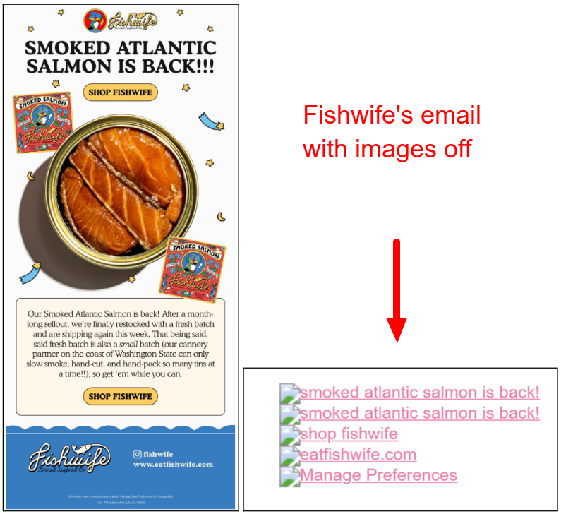
“Screen readers pick up on live text, not text embedded in an image. People who use them miss out on an image-only email’s contents just like people who don’t download images. When text doesn’t supplement images, it wastes opportunities and hurts the brand,” Kath Pay, author of Holistic Email Marketing, attests. In fact, here is an example of how a screen reader reads an image-only email.
All this is standard, well-recognized email best practices. What really triggered the resurgence of the subject was AI summaries.
AI Summaries: The Aggravator
AI engines use email text in order to summarize emails. However, an image-only email with zero-text can’t be summarized. Unless you want the fine print, unsubscribe option, and other legal information to show up in the subscriber’s pre-header.
And there have been many such real-world instances.
“My colleague Elizabeth Jacobi, MochaBear Marketing, received an all-image email to her Apple email app and the AI summary in the inbox was all about unsubscribing, because that was the only copy in the email not embedded in an image — and the only copy that the AI could read,” reveals Jeanne Jennings, founder of Email Optimization Shop.
So quite apart from visual content, the introduction of AI summaries has made good email copy a non-negotiable component.
With respect to text, Ryan Phelan, CEO of RPE Origin, recommends the following best practices:
- Add a text block to every email you send. The text block would encapsulate all the key information in your email.
- Ensure that your email copy entertains as well as informs.
- Make your pre-header and subject lines more informative.
- Use descriptive alt-text for each image.
- Prioritize adding bullet-proof buttons over textual links because they’re displayed even when images are disabled.
Enter Hybrid Emails: Image + Text
In light of all that went behind, using hybrid emails combining both images and text seems like the ideal solution. These contain relevant images but also ensure relevant context alongside the functional text, ensuring that the core message is captured, irrespective of how the recipient chooses to view the email.
The obvious benefits of hybrid emails include improved accessibility,
enhanced user experience, better tracking and analytics fine-tuning, and improved deliverability.
How do you ensure your email program gets those benefits?
Apart from sticking to standard email best practices, you might want to jot down these additional tips:
- Add alt-text, it’s non-negotiable. Make it as specific as possible. Include relevant product details.
- Embed live text in the HTML code, not in your images.
- Use bullet-proof buttons, as already recommended. Refer to this detailed blog post on how to use them.
- At the design stage, use two wireframes, one for the images-on, and another for the images-off version. Why? This will help you maintain the design hierarchy in both cases.
- Expand your email inspiration resources. Explore how brands are leveling up old-school strategies.
- Think in terms of usability as well as aesthetics. Keep yourself or your team attuned to Web Content Accessibility Guidelines.
- Design with AI as well as customers in mind. AI disruptions are likely to increase. Keep yourself updated beyond design.
Do We Have A Winner Then?
Not so fast. In spite of the clear benefits of hybrid emails, some of the major brands insist on doing the opposite. Why?
In his LinkedIn post on the issue, Dela Quist, noted email marketing expert, pointed out an “interesting phenomenon.” He bases his argument on the well-known fact that email opens are not registered so when no images have been downloaded. So in the case of image-heavy emails, downloads do occur, and opens get registered.
But this isn’t the case with emails optimized for image blocking.
As Dela reminds, such emails generate clicks from recipients who did not open the email, resulting in a “false negative.”
“Typically, around 3% of the clicks do not have a corresponding open (false negatives),” Dela explains. And this is why image-reliant brands like fashion brands prefer image-heavy emails to their hybrid counterparts. That’s Dela’s perspective on the whole matter.
This introduces another layer to the discussion, the contextual layer. You do what works for your brand and your audience.
While conforming to email best practices—let’s not forget!
While we do concur on the point of context, given the disaster that all-image emails can turn into, hybrid design seems to be the only safe option, at least for now. The approach doesn’t bar visually-rich emails. It adds accessibility, a key ingredient, into the design mix.
So fashion brands out there, full points on your visually-rich emails. Make them accessible too, and you punch your ticket.

Create Future-proof Design, with Email Mavlers!
With our email template services, you get:
- The support of 150+ trained designers and developers
- 50+ ESP expertise, and 12 years of experience
- Compatibility testing across 40+ email clients
- 30-day post-sales support
- Standard/custom modules, and much more
So, get in touch with our email marketing team today!