

Every email developer knows this moment.
You spend hours refining an HTML email.
- The design looks pixel-perfect.
- The code is clean.
- The copy feels sharp.
You preview it in the browser. Everything works beautifully. Then you hit send. And minutes later, someone messages you: “The layout is broken in Outlook.”
Welcome to the chaotic world of cross-client email testing. Unlike websites, emails don’t live in a predictable world.
A website usually renders across a handful of modern browsers with relatively stable behavior. An HTML email survives something far messier, a decades-long collision of outdated rendering engines, inconsistent CSS support, and competing client standards.
One user opens your email in Outlook 2007, still powered by the Microsoft Word rendering engine. Another opens it on the latest iPhone in dark mode. And every client interprets your code differently.
- Some ignore media queries completely.
- Some strip out your <style> blocks.
- Some invert your carefully chosen colors.
- Some resize images without warning.
Which means email development isn’t just design. It’s controlled survival across chaos.
At Email Mavlers, cross-client QA (Quality Assurance) is not a final checkbox. It’s the backbone of the entire production workflow. Because reliable emails are not built at send time. They’re built during testing.
This is where the real craftsmanship happens – the debugging, the rendering fixes, the device checks, the endless battle against broken inboxes.
In this guide, we break down what professional email QA (Quality Assurance) really looks like: the process, the tools, the bugs, the fixes, and the expertise required to make one email render consistently across 50+ clients and devices.
Let’s cut to the chase.
Before getting into the technical weeds of testing, it’s important to understand where QA (Quality Assurance) actually fits inside a professional email production workflow.
The Email Mavlers production workflow: Where QA lives
At Email Mavlers, QA (Quality Assurance) is not the final step. It’s woven into a structured production pipeline from the very beginning. Here is a 6-step workflow that Email Mavlers follows.
1. Brief intake and design file receipt
Clients deliver design files in various formats, including Figma, Adobe XD, PSD, Sketch, PDF, and even annotated screenshots. Along with the visual design, the brief includes campaign context: audience, ESPs (Email Service Providers) in use, target devices, and any specific rendering requirements.
2. Design analysis and asset extraction
Before a single line of code is written, the development team analyzes the design for email-compatibility risks. This is where experience matters. A developer who has spent years in email production can look at a Figma file and immediately flag: “That custom font won’t load in Gmail,” or “That CSS gradient won’t render in Outlook 2019.”
Assets like images, icons, and custom graphics are extracted and optimized for email delivery during this stage.
3. HTML email development
The actual coding begins. Unlike modern web development, HTML emails are still largely built using table-based layouts, inline CSS, and carefully engineered fallbacks for clients that don’t support modern HTML5/CSS3. It’s a deliberate step back in time, for very good technical reasons (which we’ll explore later).
4. QA and Cross-client testing
The developed HTML is passed through a rigorous quality assurance process. This involves two distinct layers:
- Design QA: Comparing the rendered email against the original design file to ensure accuracy.
- Cross-client testing: Running the email through 50+ rendering environments to identify client-specific issues.
5. Bug fixing and final polishing
Rendering issues identified during testing are diagnosed and fixed, often requiring client-specific CSS hacks, conditional comments, VML fallbacks, or targeted workarounds.
6. Final delivery
The tested, polished HTML is delivered to the client or uploaded directly to their ESP, ready for sending. QA and cross-client testing is the longest and most technically demanding phase of this workflow. It’s also the phase most commonly underestimated by those outside of email production, and the phase where experience and rigor make the biggest difference in output quality.
People who have worked exclusively in web development often assume that email QA is a simplified version of browser testing. It’s not. In many ways, it’s significantly harder.
Why is email QA fundamentally different from website QA?
Here are four reasons why email testing is fundamentally different from website QA.
1. The browser monoculture vs. The email client chaos
Web developers today largely test across Chrome, Firefox, Safari, and Edge, four modern browsers that, despite their differences, have largely converged on supporting current web standards. The HTML5 and CSS3 specs are implemented consistently enough that a well-coded website will behave predictably across all four.
Email clients are the polar opposite of this reality. The email client ecosystem is a fragmented, decades-old patchwork of rendering engines, each with its own interpretation of what HTML and CSS should look like, or whether certain properties should be supported at all. Consider the range:
- Outlook 2007–2021 on Windows uses Microsoft Word’s rendering engine (yes, really, the same engine that formats your Word documents). This means it has almost no support for modern CSS, treats padding and margins inconsistently, and requires the Visual Markup Language (VML) for features like background images and rounded corners.
- Gmail strips <head> styles in many of its environments, forcing developers to rely on inline CSS, and even then, it ignores or overrides certain properties depending on the browser it’s running in.
- Apple Mail is among the most capable renderers, but it introduces its own dark mode auto-inversion behavior that can completely transform carefully chosen brand colors.
- Yahoo Mail has its own CSS quirks, particularly around margin collapsing and float behavior.
- Samsung Mail on Android adds yet another rendering layer with its own peculiarities.
Testing a website across four browsers is manageable. Testing an email across 50+ combinations of email clients, operating systems, browsers, device models, and display modes is a discipline unto itself.
2. No DevTools. No live reload. No shared standards.
When a website breaks, a developer opens DevTools, inspects the element, identifies the offending CSS property, and fixes it in seconds. The feedback loop is immediate, and the debugging environment is rich.
Email debugging is the opposite experience. There is no universal DevTools for email. You can’t inspect the rendered HTML of an email in Outlook. You can’t right-click inside Gmail’s mobile app and “inspect element.” You have to reason about bugs from rendered screenshots, cross-reference your code against known client limitations, and apply fixes, then re-render the entire email to see if the fix worked. Every iteration takes time.
Furthermore, the HTML and CSS specifications for email don’t exist in the same way they do for the web. The W3C doesn’t publish an “email rendering specification.” Email clients implement or ignore HTML/CSS features as they see fit, with no obligation to conform to any external standard.
3. The update problem
Web browsers update silently and frequently. Chrome, Firefox, and Edge are evergreen browsers. They push updates automatically, and web developers generally benefit from these updates, which add CSS support and fix bugs.
Email clients have a completely different update cadence. Outlook 2007, 2010, 2013, 2016, 2019, and 2021 are distinct versions with distinct rendering behaviors, and all are still actively used by millions of corporate and enterprise users.
Testing email in Outlook means testing across every major version, because you have no control over which version your recipient is using. A fix that works in Outlook 2021 may introduce a new bug in Outlook 2013.
4. The context diversity problem
Websites are typically viewed in a fixed or semi-fixed context: a browser window, usually on a screen. Emails are opened in wildly variable contexts:
- On a 32-inch 4K monitor in a dark corporate Outlook window
- On a 5.9-inch phone screen held vertically in bright sunlight
- On a tablet in landscape orientation with the default iOS Mail app
- On a laptop screen in dark mode with Gmail running in Chrome
- On a work PC running Windows 7 with a version of Outlook that hasn’t been updated since 2015
Every environment changes the rendering equation.
An email that collapses beautifully into a single-column layout on iPhone might completely fail on an older Android device or Windows Phone.
A clean white-background design built for light mode can suddenly become unreadable when Gmail’s dark mode starts rewriting colors on Android.
Same email. Different inbox. Completely different experience. This diversity of context is why cross-client testing is not an optional add-on. It’s the entire job.

Understanding cross-client email testing: The scope of the challenge
When email professionals talk about “cross-client testing,” they mean systematically validating how an HTML email renders in every major combination of:
- Email client application (Outlook, Gmail, Apple Mail, Yahoo, etc.)
- Operating system (Windows 10/11, macOS, iOS, Android)
- Browser (for webmail clients such as Chrome, Firefox, Safari, Edge)
- Display mode (light mode vs. dark mode)
- Device model (iPhone 14 vs. iPhone 17, Android 11 vs. Android 15)
- Screen resolution and DPI (standard vs. retina vs. high-DPI Windows displays)
When you start multiplying these variables, the number of unique rendering environments grows very quickly. At Email Mavlers, our standard testing suite covers 50+ distinct environments, and for enterprise campaigns with specific audience demographics, we go even further.
The goal is not simply to confirm that the email “doesn’t look broken.”
Professional QA validates:
- Layout integrity: Does the multi-column layout stay in columns where expected? Does it correctly collapse to a single column on mobile?
- Typography rendering: Are the correct fonts loading? Are fallback fonts displaying cleanly? Are font sizes, weights, and line heights consistent?
- Image display: Are images loading? Are retina images being served correctly? Are alt texts displaying where images are blocked?
- Spacing and alignment: Are padding and margin values consistent? Are elements aligned as designed?
- Color accuracy: Are brand colors rendering correctly? Are dark mode overrides being handled properly?
- Link functionality: Are all links clickable? Are tracked URLs resolving correctly?
- Responsive behavior: Are breakpoints triggering correctly? Are mobile-specific styles being applied?
- Interactive elements: Are any CSS-powered interactive components (accordions, carousels, hover states) functioning or gracefully degrading?
- Accessibility: Is the email navigable via a screen reader? Is the color contrast adequate? Are ARIA attributes in place?
The email client ecosystem: A client-by-client breakdown
1. Desktop email clients: The oldest battlefield
Desktop email clients, particularly those in the Microsoft Outlook family, represent the most technically demanding testing environment in email production. Here’s a detailed look at each major category.
a) Outlook 2007–2021 (Windows): The word engine problem
This is the most consequential rendering limitation in all of email development, and it surprises almost everyone who first encounters it.
Starting with Outlook 2007, Microsoft replaced its Internet Explorer-based rendering engine with the one from Microsoft Word. The reasoning was internal, security, and consistency with Office products, but the impact on email development was severe and long-lasting.
The Word rendering engine does not understand modern CSS. It handles floats inconsistently. It ignores or misinterprets properties like background-image, border-radius, box-shadow, max-width, min-width, position, and many others. Flexbox and CSS Grid, cornerstones of modern web layout, are essentially unsupported.
What does this mean in practice? Email developers targeting Outlook must:
- Use table-based layouts instead of flexbox or grid for any structural elements.
- Use VML (Vector Markup Language), a Microsoft-proprietary format from the early 2000s, for background images, rounded corners, and certain button styles.
- Use Outlook conditional comments (<!–[if mso]>) to inject Outlook-specific code that other clients ignore.
- Avoid CSS properties that Outlook doesn’t support, or provide carefully constructed fallbacks.
- Test every version separately, because quirks differ between Outlook 2007, 2010, 2013, 2016, 2019, and 2021.
b) Apple Mail: The capable but treacherous renderer
Apple Mail is widely considered the most capable email rendering environment, with strong support for modern HTML5 and CSS3. It handles media queries, CSS animations, flexbox (in some versions), and web fonts reliably, making it a delight to code for.
The challenge comes from Apple Mail’s dark mode behavior. When a macOS or iOS user has dark mode enabled, Apple Mail analyzes the email and automatically applies color inversions and background changes. If your email has a white background and dark text, Apple Mail may invert these to a dark background with light text, even if you’ve set explicit colors.
The result can range from subtly wrong (your brand colors look slightly off) to catastrophically broken (a logo with a white background now has a dark background, or text set in a brand color that happens to be dark becomes invisible against a dark background).
Testing Apple Mail dark mode requires separate validation for Apple Mail 14, 15, and 16, each in both light and dark mode, because Apple’s rendering behavior and dark mode CSS support have evolved across macOS versions.
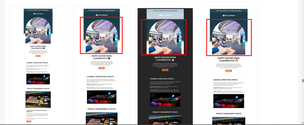
Rounded button rendering problem in Outlook
Here are the rendering problems you may encounter in Outlook regarding the rounded button.
1. Original button design
The original CTA button is designed using modern CSS with border-radius.

2. Apple Mail / Modern email clients
The button renders perfectly in clients like Apple Mail, Gmail, and most mobile email apps.


3. Outlook desktop rendering issue
However, Outlook desktop applications powered by the Word rendering engine ignore border-radius, so the button appears flat rather than rounded.

<tr>
  <td valign="top" align="center"><!--[if mso]>
    <v:roundrect xmlns:v="urn:schemas-microsoft-com:vml"
      xmlns:w="urn:schemas-microsoft-com:office:word"
      href="#" style="height:64px;v-text-anchor:middle;width:235px;" arcsize="50%" stroke="f" fillcolor="#59C0ED">
      <w:anchorlock/>
      <center style="color:#ffffff;font-family:Futura, Arial, sans-serif;font-size:18px;font-weight:bold;text-transform:uppercase;">Join Now</center>
    </v:roundrect>
    <![endif]-->

    <!--[if !mso]><!-- -->
    <table border="0" cellspacing="0" cellpadding="0" align="center" style="width:235px; border-radius:60px;" bgcolor="#59C0ED"       width="235">
      <tr>
        <td class="em_defaultlink" valign="middle" align="center" height="64" style="
          height:64px; font-family:'Futura', Arial, sans-serif; font-size:18px; color:#ffffff;
          font-weight:700; text-transform:uppercase; border-radius:60px;">

          <a href="#" target="_blank" style="text-decoration:none;color:#ffffff;line-height:64px;display:block;">Join Now </a>
        </td>
      </tr>
    </table>
    <!--<![endif]--></td>
</tr>
4. DPI Scaling: Outlook’s other rendering nightmare
Beyond the Word engine, Outlook on Windows introduces another specific challenge: DPI scaling. On high-DPI monitors (125%, 150%, 175% scaling), Outlook scales images and layout elements in a way that doesn’t follow the developer’s width attributes.
A 600px-wide email template may suddenly render at 750px or 900px effective width, causing layouts to overflow, images to scale incorrectly, and text to appear at unexpected sizes.
This is why our testing list explicitly includes separate entries for Outlook 2016 DPI, Outlook 2019 DPI, and Outlook 2021 DPI. These aren’t redundant, they’re distinct rendering environments that require targeted fixes, typically involving specific mso- prefixed CSS properties or VML adjustments.
After applying VML (Vector Markup Language)
By adding a VML fallback specifically for Outlook, the rounded button renders correctly across all Outlook desktop versions while maintaining the modern HTML version for all other email clients.

This is not a sign of poor coding. It’s a sign of expertise.

2. Webmail clients: The CSS limitation maze
a) Gmail: The popular client with strict CSS rules
Gmail is the world’s most popular email client, but it’s also one of the most restrictive when it comes to the HTML and CSS it supports. Understanding Gmail’s limitations is fundamental to professional email development.
The style stripping problem
For years, Gmail stripped all content within <style> blocks in the <head> of HTML emails. This forced developers to inline every CSS property directly on every HTML element, a tedious but necessary practice. Gmail has improved support for embedded styles, but its behavior still varies significantly depending on whether you’re using:
- Gmail in Chrome on desktop
- Gmail in Firefox on desktop
- Gmail in Safari (on Mac or iOS)
- Gmail’s mobile app on iOS
- Gmail’s mobile app on Android
Each of these environments has different levels of CSS support. A @media query that works in Gmail on Chrome may be completely ignored in Gmail’s iOS app. A <style> block that loads correctly in one context gets stripped in another.
CSS property limitations
Gmail does not support several commonly used CSS properties, including:
- margin shorthand in some contexts (use padding on wrapper tables instead)
- border-radius partially or inconsistently
- External fonts via @font-face in most environments
- CSS animations in all environments
- CSS custom properties (variables) in many contexts
This means an email carefully designed with a custom brand font will render in Gmail using system font fallbacks. If the fallback isn’t accounted for in the development process, the typography can shift significantly, changing letter spacing, line length, and overall visual balance.
b) Outlook.com and Office 365: The Web Outlook problem
Microsoft’s webmail clients, Outlook.com and Office 365, use their own rendering engine distinct from the desktop Outlook application. While they’re not as restrictive as the Word engine-based desktop clients, they introduce their own set of CSS limitations.
Notably, Outlook.com strips certain CSS properties, particularly those related to positioning and z-index. It also handles background images inconsistently and has historically had problems with gap properties in certain layout contexts. Testing across Chrome, Firefox, Edge, and Safari for Outlook.com is necessary because the browser’s rendering engines interact with Outlook.com’s CSS handling in different ways.
c) Yahoo Mail: The legacy wildcard
Yahoo Mail still has a significant user base, particularly in certain demographics and geographies, and it introduces its own CSS parsing quirks. Yahoo is notorious for unexpected behavior around margin collapsing, float clearing, and responsive layout triggering. Its dark mode behavior also requires special attention, as it can override background colors in ways distinct from Gmail’s or Apple Mail’s approaches.
Mobile email testing: The diversity problem
Here are some email testing issues across different email clients.
1. iOS: Apple Mail vs. Gmail vs. Outlook App
On iOS, three distinct email applications render emails completely differently, and they don’t share a single rendering engine:
- Apple Mail on iOS uses WebKit, Apple’s browser engine, which means it supports strong CSS and has full dark mode auto-inversion.
- Gmail for iOS uses Gmail’s own rendering engine inside a web view, with the same Gmail CSS limitations described above.
- Outlook for iOS uses its own rendering stack, which supports certain modern CSS features but has quirks in responsive behavior and interactive elements.
On top of this, screen size variation matters. An email tested on an iPhone 14 at a logical width of 390px will render differently than an iPhone 17 Pro Max at 430px. Media query breakpoints need to accommodate this entire range.
2. Android: A fragmentation nightmare
Android email testing is arguably the most complex of all mobile testing scenarios. The Android ecosystem includes:
- Multiple device manufacturers (Samsung, Google, OnePlus, Xiaomi, Motorola, and dozens more)
- Multiple default email apps (Samsung Mail, Android’s Gmail app, AOSP Mail on some devices)
- Android OS versions ranging from Android 11 through Android 15, each with different WebView versions
- Manufacturer-specific UI customizations that can affect how email apps display content
Samsung Mail, in particular, has historically been one of the most problematic email clients, with inconsistent media query support and its own flavor of dark mode behavior that can differ from Gmail’s approach even on the same device.
Testing email on Android effectively means selecting a representative sample of devices and OS combinations and accepting that you cannot cover every possible Android environment.
Dark mode testing: The design challenge of the decade
Dark mode support has become one of the most critical and complex areas of email QA over the past few years. As operating systems and applications have broadly adopted dark mode as a first-class feature, email clients have responded by implementing their own dark mode behaviors in at least 4 distinct ways.
Here are the four dark mode approaches in email clients.
1. Full auto-inversion (no developer control): Some email clients, notably Gmail on Android in certain configurations, automatically invert all colors in an email with no mechanism for the developer to opt out. White backgrounds become dark. Dark text becomes light. And any background image you’ve specified? A color overlay is applied to it. For emails with carefully branded color palettes, this can be visually catastrophic.
2. Partial inversion (preserves some colors): Apple Mail on iOS and macOS takes a more nuanced approach. It will invert light backgrounds to dark, but it attempts to preserve foreground colors, such as brand-colored text and certain image treatments. The challenge is that “attempting to preserve” doesn’t mean it always gets it right, and the behavior has changed across iOS and macOS versions.
3. Developer-controlled with media queries: A growing number of clients, including Apple Mail and Outlook on iOS, support the @media (prefers-color-scheme: dark) media query, which allows developers to define explicit dark mode styles. This is the preferred approach, but it requires developers to design and code two complete visual themes for each email, significantly increasing development time and complexity.
4. No dark mode support: Some email clients don’t implement dark mode at all and always render emails in light mode, regardless of the user’s system settings. This is actually the least problematic behavior from a development standpoint.
Dark mode QA best practices we follow at Email Mavlers
Proper dark mode testing means:
- Visual comparison of the email in both light and dark mode across every client that supports dark mode
- Explicit dark mode styles added via prefers-color-scheme media queries
- color-scheme meta tags added to opt into system-level dark mode awareness
- Transparent PNGs and SVGs for logos, to avoid white background halos appearing in dark mode
- Explicit dark mode background overrides on containers that shouldn’t auto-invert
- Color contrast validation in dark mode, specifically, (a color combination with adequate contrast in light mode may fail in dark mode)
At Email Mavlers, dark mode testing is a standard part of every QA pass, not an optional extra.
Given the sheer number of variables and rendering quirks we’ve detailed, the QA process itself must be rigorous and layered.
The QA process: How we actually test emails
Here is the two-layered process we follow at Email Mavlers to test emails.
1. Layer one: Design QA (pixel-perfect comparison)
The first layer of QA involves a meticulous comparison of the rendered HTML email with the original design file. This is done by placing the two side by side, the Figma or PSD design on one monitor, the rendered email in a browser on the other, and systematically checking every element:
- Typography: Font family, size, weight, line height, letter spacing, color
- Colors: Background colors, text colors, border colors, button colors
- Spacing: Padding, margin, gap between sections
- Images: Correct images in correct positions, proper sizing, and correct alt text
- Alignment: Text alignment, image alignment, button alignment
- Buttons: Shape, color, border radius, padding, font styling, hover state (where supported)
- Layout structure: Column widths, row heights, section proportions
Deviations from the design are logged and corrected before cross-client testing begins. There’s no point running 50+ client tests if the baseline rendering doesn’t match the design.
2. Layer two: Cross-client testing
Once the design QA is clean, the email moves into cross-client testing. This involves two primary methodologies: automated preview rendering and live device testing.
Tools of the Trade: What professional email QA actually uses
Here are five key strategies professional email quality analysts actually use.
1. Litmus: The industry standard preview platform
Litmus is one of the two dominant automated email preview tools in the industry. It works by rendering an HTML email across dozens of email client environments simultaneously, then returning screenshot previews of how the email appears in each environment.
Litmus’s testing suite covers major desktop clients (Outlook across all versions, Apple Mail across versions, Thunderbird), webmail clients (Gmail across browsers, Yahoo Mail, AOL, Outlook.com), and mobile clients (iPhone across iOS versions, Android Gmail, Samsung Mail, and others).
Key Litmus capabilities relevant to QA include:
- Email previews across 100+ clients and devices
- Email analytics integration for open tracking and device reporting
- Spam testing via multiple spam filter engines simultaneously
- Accessibility checking for basic WCAG compliance
- Link validation to catch broken URLs
- Load time analysis to identify performance issues
From a professional QA perspective, Litmus is essential for rapid identification of rendering issues across a wide client set. A developer can upload an HTML file, run previews, and, within a few minutes, have a visual report showing exactly which clients render correctly and which have issues.
Limitation of Litmus
It provides screenshots, not live, interactive email environments. Interactive elements (CSS-powered menus, hover states, animation) don’t behave as they would in a real inbox. Images are cached. And the rendering environment, while highly accurate, is still a simulation.
2. Email on Acid: The QA workflow specialist
Email on Acid is Litmus’s primary competitor, with a comparable device coverage footprint and a few workflow differentiators. Email on Acid is particularly strong on:
- Checklist-driven QA workflows: Customizable QA checklists that teams can use as standardized testing protocols
- Pre-send review: A step-by-step review process built into the tool’s interface
- Campaign precheck: Automated pre-send validation covering rendering, spam, links, and images
- Accessibility testing: More detailed accessibility reporting than some competitors
Like Litmus, Email on Acid is invaluable for wide-coverage screenshot previews but shares the limitation that it cannot fully simulate interactive email behavior.
At Email Mavlers, both tools are used in combination. Their rendering environments are not identical, and using both catches edge cases that either tool alone might miss.
3. Live device testing: Where screenshots fall short
Automated preview tools are powerful and efficient, but there are scenarios where they cannot replace testing on actual physical devices:
Interactive email elements: CSS-powered carousels, accordions, hover effects, and AMP emails need to be tested in a live inbox on a real device to validate behavior. A screenshot cannot tell you whether a CSS checkbox hack works or whether a tab component responds to taps correctly.
Dark mode rendering: while preview tools have improved dark mode simulation, there are still subtle differences between a simulated dark mode preview and dark mode on an actual device running the latest OS version.
Animation and motion: CSS animations, @keyframes, and transition properties need live testing to confirm they play correctly (and degrade gracefully where unsupported).
Rendering nuances on specific hardware: High-DPI screens, notched display areas, and manufacturer-specific email app behaviors sometimes only reveal themselves on physical hardware.
Font rendering: System font rendering and antialiasing vary between physical devices in ways that screenshots can’t fully capture.
At Email Mavlers, live device testing is deployed for emails that include interactive elements, heavy use of custom fonts, animation, or where specific device behavior has been flagged as a concern by the client brief.
4. BrowserStack and real device labs
For scenarios requiring testing across a specific matrix of device and OS combinations beyond what physical device labs can cover, cloud-based real device testing platforms like BrowserStack can be used. These services provide access to a library of real physical devices in the cloud, not emulators, allowing developers to open an email in a specific email app on a specific device model running a specific OS version, and interact with it as a real user would.
This is particularly useful for Android testing, given the enormous device fragmentation in the Android ecosystem.
5. Manual QA: The layer automation can’t replace
Even with the most comprehensive tooling, manual QA remains essential. Experienced email QA professionals bring contextual judgment that email testing tools cannot automate:
- Noticing that a client-reported issue only appears under a specific combination of conditions that automated tests don’t cover
- Evaluating aesthetic quality, whether a fallback font renders in a way that’s visually acceptable, even if technically correct
- Validating dynamic content placeholders, checking that merge tags and personalization tokens are syntactically correct and positioned properly
- Reviewing plain text versions, every HTML email should have a carefully formatted plain text version, which requires human review
- Checking tracked links, confirming that click tracking wrappers haven’t broken link functionality
- Reviewing email in the context of the inbox, how the subject line, preview text, and from name appear in the inbox view before the email is even opened
Email accessibility and performance QA: The often-overlooked dimensions
1. Accessibility testing: Emails that work for everyone
Email accessibility has historically received far too little attention in production workflows, but it’s increasingly recognized as both an ethical requirement and a practical quality standard. The Litmus State of Email Accessibility report highlights significant gaps in current industry practices.
Here are three areas that need to be addressed.
a) Screen reader compatibility
Screen readers and assistive technologies like JAWS, NVDA, and VoiceOver process email HTML sequentially and announce content based on semantic markup. An email built with pure tables and no semantic structure will be difficult or impossible to navigate meaningfully via a screen reader.
Accessibility best practices for email HTML include:
- ARIA role attributes: Using role=”presentation” on layout tables signals to screen readers that these tables are structural, not data containers, preventing confusing announcements of column and row counts.
- alt text on all images: Every image must have appropriate alt text. Images that are purely decorative get alt=””. Images containing meaningful information (product photos, infographics, charts) receive descriptive alt text.
- Semantic heading hierarchy: Using <h1>, <h2>, <h3> appropriately (or styled paragraphs with ARIA heading roles) helps screen reader users navigate the email’s content structure.
- Descriptive link text: “Click here” and “Read more” are meaningless in isolation. Link text should describe the destination or action: “Download the Q4 report” or “View this product on our website.”
- lang attribute on the <html> element: This tells screen readers what language the email is written in, enabling correct pronunciation.
b) Color contrast standards
WCAG 2.1 requires a minimum contrast ratio of 4.5:1 for normal text and 3:1 for large text. Email QA should include validation of color contrast for all text against its background, including in dark mode, where contrasts can shift dramatically when client-applied inversions occur.
Tools like the WebAIM Contrast Checker or Litmus’s built-in accessibility checker can flag contrast violations, but human review is needed to evaluate contrast in the context of dark mode auto-inversion.
c) Link and button target sizes
On mobile devices, touch targets should be at least 44×44 pixels to be reliably tappable. Buttons and linked images that are too small are both accessibility and usability failures and tend to drive down click-through rates.
2. Performance and deliverability QA
The quality of an email doesn’t end at visual rendering. Performance and deliverability-related factors require their own QA attention.
Here are five things you need to pay attention to.
a) File size optimization
Email service providers and email clients have size limits that affect deliverability and load speed. Gmail, for example, clips emails that exceed approximately 102KB of HTML. When an email is clipped, the recipient sees a “View entire message” link that removes the bottom portion of the email, including CTAs, footers, and unsubscribe links. This is both a usability issue and, depending on jurisdiction, a legal compliance issue (CAN-SPAM and GDPR require accessible unsubscribe mechanisms).
b) Image optimization
It is equally important. Unoptimized images slow load times, increase data usage for mobile recipients, and can trigger size-related clipping issues. Every image should be compressed appropriately (without visible quality loss) and served from a reliable CDN.
c) Spam testing
A beautifully designed email that ends up in the spam folder is a failed email. Spam testing involves running HTML and email metadata through spam-filter algorithms to identify characteristics that could trigger filtering. Tools like Litmus and Email on Acid provide spam filter previews that simulate how major filters (SpamAssassin, Barracuda, and others) evaluate the email.
Common spam triggers in email code include:
- Excessive use of! important in CSS
- Hidden text or images
- Extremely high image-to-text ratios
- Missing or malformed unsubscribe links
- Suspicious link patterns in tracked URLs
- JavaScript (which should never be present in marketing email HTML)
d) Link and click tracking validation
In production email campaigns, the ESP typically wraps all links in tracking redirects to measure click-through rates. QA must validate that:
- Every intended link has tracking applied
- Tracking wrappers haven’t corrupted the underlying URL
- All links resolve to the correct destination page (no 404 errors)
- Unsubscribe links route to the correct preference center or one-click unsubscribe handler
e) Dynamic content and personalization QA
Modern email campaigns frequently use merge tags, conditional content blocks, and dynamic personalization that varies by recipient. QA for personalized content requires:
- Validating the merge tag syntax is correct for the ESP in use
- Testing with edge-case data (very long names, missing fields, unusual character sets)
- Confirming the conditional logic renders the correct content block for each recipient condition
- Checking that fallback values for missing personalization data are appropriate
Now, let’s talk about the complexities of email development in comparison to traditional web development.
Why email development is harder than traditional web development
This is worth stating plainly for the benefit of clients, stakeholders, and newer developers: HTML email development is, in many measurable ways, harder than modern web development.
Here’s why:
1. You’re coding for the past and the present simultaneously.
Web developers can mostly target modern browsers and use current CSS features confidently. Email developers must support Outlook 2007’s Word engine, software nearly two decades old, while also handling the latest iOS CSS features. These requirements pull in completely opposite directions.
2. There’s no universal standard.
The W3C doesn’t govern email rendering. There’s no specification that email clients must conform to. Every client does whatever its developers decide, whenever they decide it.
3. Debugging is slow and painful.
No cross-client DevTools. No live-updating previews. Debugging involves writing code, uploading to a test platform, waiting for renders, analyzing screenshots, forming hypotheses, writing fixes, and repeating.
4. Table-based layout is both necessary and painful.
Modern web developers use flexbox and grid for everything. Email developers are still extensively using nested HTML tables for layout in 2025, because table-based layout is the only thing that reliably works across Outlook, older mobile clients, and everything in between.
5. Inline CSS is the rule, not the exception.
Web developers separate HTML from CSS as best practice. Email developers must frequently inline CSS properties on every element, resulting in verbose, repetitive code that’s harder to maintain and update.
6. Every client can break every email.
A website broken in one browser doesn’t affect users of other browsers. An email broken in Outlook affects every Outlook user on your list, potentially millions of recipients.
7. You can’t fix it after you’ve sent it.
A broken website can be fixed in minutes, and the fix is immediately live. A broken email that’s already been sent cannot be recalled or fixed for recipients who have already opened it. The bar for pre-send quality assurance is correspondingly higher.
Despite the foundational challenges, the demands on email developers continue to grow as the push toward advanced functionality intensifies.
Interactive email testing: The emerging complexity
Interactive emails sit at the edge of what modern email development can do.
- Accordions.
- Carousels.
- Tabbed layouts.
- Hover states.
All powered by CSS inside environments that barely agree on basic rendering rules. It’s one of the most exciting areas in email design, and easily one of the most technically demanding.
CSS interactivity and the checkbox hack
Many CSS-based interactive elements in email rely on the “checkbox hack”, using hidden <input type=”checkbox”> elements and the: checked pseudo-class selector to toggle visible states without JavaScript (which is not supported in email). This technique can create functioning accordions, navigation menus, and tabbed interfaces in email clients that support it.
The challenge is that support for these techniques is highly variable:
- Apple Mail generally supports CSS interactivity well
- Gmail does not support the checkbox hack reliably
- Outlook does not support CSS interactivity at all (Word engine)
- Outlook.com has limited support
This means interactive elements must have graceful fallbacks, static versions of the content that display in clients where the interactive version won’t work. Designing, developing, and testing both the interactive and fallback versions adds significant complexity to the production process.
AMP for email: Interactivity at scale
AMP (Accelerated Mobile Pages) for Email is a framework developed by Google that allows genuinely interactive, real-time email experiences, forms, shopping carts, live content updates, in supported clients. Gmail is the primary supporter of AMP email.
AMP email requires:
- A separate AMP HTML version of the email
- AMP-specific validation (the AMP component must pass Google’s validator)
- DKIM/DMARC/SPF email authentication (required to enable AMP delivery)
- Fallbacks to standard HTML for non-AMP clients
- Testing specifically in the Gmail AMP environment
AMP email QA is a specialized skill set that adds further layers to the testing process.
Years of email production experience translate into pattern recognition for recurring bug types that must be fixed daily.
Common bugs encountered during QA and how they’re fixed
Here are some of the most common issues identified during QA and the approaches used to fix them:
Are images not displaying properly and causing a layout break in Outlook?
Symptom
Multi-column layout breaks or shifts in Outlook when images do not render correctly, especially large or full-width images.
Cause
This happens when large images (e.g., 1200px width banners) are used without proper email-safe constraints, such as:
- Missing or inconsistent width attribute
- No max-width handling
- CSS-only responsiveness relying on Outlook support
How to fix?
Outlook’s Word-based rendering engine does not reliably support max-width, so oversized images can expand the table container and break the layout.
Problem example

After fix
Fixed code
  <tr>
                <td valign="top" align="center" class="em_full_img"><img src="https://s3.amazonaws.com/eoa_uploads/2026-05-14/RBySEd1YZsUYsRjM1TIM/banner.png"  width="650" alt="" border="0" style="display:block; width: 650px; max-width: 650px; font-family:Arial, sans-serif; font-size:17px; line-height:20px; color:#000000;" /></td>
              </tr>
Are background images not rendering in Outlook?
What is the symptom?
Background images set in CSS are completely absent in Outlook Windows clients.
How to fix?
Use VML fallbacks for background images in Outlook. Standard CSS background-image is ignored by the Word engine.
Is Gmail clipping long emails?
Symptom
In Gmail, email content is truncated, and a “View entire message” link appears at the bottom of the email.
Cause
Gmail may clip long emails when the message body exceeds a certain size. While Google does not publish any official size limit, this behavior is commonly observed when the total HTML payload becomes heavy (often around ~102KB in practical scenarios). However, this threshold should be treated as an approximation rather than a fixed rule.
How to fix?
To prevent clipping, optimize the email structure, and reduce overall payload size:
- Minify CSS, especially inline styles
- Optimize and simplify HTML structure
- Remove unnecessary comments and redundant markup
- Optimize image usage and asset loading
- Break very long emails into shorter, modular sections when possible
Want to learn how to avoid Gmail clipping? This blog might come to your rescue.
Now, let’s discuss the font fallback issues.
Font fallback issues in email development
Symptom
The email renders in an unexpected system font, causing noticeable layout shifts, spacing issues, and changes in text proportions.
This commonly happens when a custom web font fails to load because many email clients either partially support or completely block web fonts.
Cause
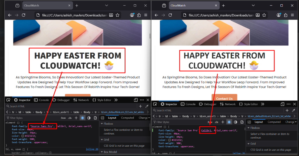
Custom fonts such as Source Sans Pro, Poppins, Montserrat, or Inter are not considered fully email-safe fonts. When these fonts are blocked by the email client, the design falls back to the next available font in the font-family stack.
A major mistake developers make is defaulting directly to Arial without considering visual similarity to the original brand font.
For example:
font-family: 'Source Sans Pro', Arial, sans-serif;While Arial is technically email-safe, its proportions and spacing differ significantly from Source Sans Pro, which can alter the visual appearance of the design.
Better approach: Choosing a similar fallback font
Instead of using the first generic safe font available, experienced email developers try to match the fallback font as closely as possible to the original design font.
For example, when using Source Sans Pro, a fallback like Calibri often preserves the layout and typography more accurately than Arial.
Recommended example
font-family: 'Source Sans Pro', Calibri, Arial, sans-serif;This creates a smoother visual fallback across clients where web fonts are unsupported.
Why does this matter?
Fallback fonts directly affect:
- Line wrapping
- Button widths
- Text spacing
- Overall email balance
- Mobile responsiveness
A poor fallback choice can completely change the intended layout.
Professional email developers, therefore:
- Test emails with web fonts disabled
- Compare fallback rendering across major clients
- Choose fallback fonts with similar metrics and proportions
- Avoid layouts that only work with one exact font
Rendering comparison between the rendering and the actual fonts
Fallback font: Arial
Arial has wider character spacing and different proportions than Source Sans Pro.
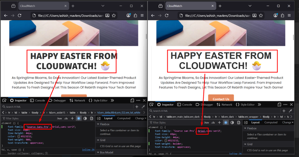
Fallback font: Calibri
Calibri provides a closer visual match to Source Sans Pro and maintains better layout consistency.
Using proper fallback typography is not just a design preference. It is a critical part of production-level email development and cross-client rendering consistency.
Do you experience color inversions in dark mode?
Symptom
Email looks completely different in dark mode, with wrong colors, invisible text, and logo halos.
How to fix?
- Add explicit prefers-color-scheme: dark media query styles.
- Use the color-scheme meta tag.
- Export logos as transparent PNGs.
- Set critical foreground colors to resist auto-inversion.
- Add dark mode background colors explicitly.
Is responsive layout not triggering on Android?
Symptom
Email doesn’t reflow to a single-column layout on Android devices.
Cause
Missing viewport meta tag, or media queries not being parsed by Android’s email app.
How to fix?
Ensure <meta name=”viewport” content=”width=device-width, initial-scale=1″> is present. Use fluid layout techniques (percentage-based widths) as a baseline rather than relying exclusively on media queries for responsive behavior.
Are there spacing inconsistencies between email clients?
Symptom
Paragraph spacing, section gaps, or padding look different across clients.
How to fix?
- Use <td> padding rather than CSS margin where possible (more universally supported).
- Explicitly reset margin and padding on all elements.
- Use spacer <td> elements for precise spacing control in Outlook.
- Add line-height explicitly to all text elements.
While the individual fixes are complex, the real challenge lies in applying these solutions consistently across the entire spectrum of inboxes.
The 50+ client matrix: What full coverage actually takes
To make the scope of cross-client testing concrete, here is the full testing matrix that Email Mavlers runs as standard:
Desktop email clients
| Client | Notes |
| Outlook 2007 | Uses Microsoft Word rendering engine and no CSS3 support |
| Outlook 2010 | Word engine: Limited CSS, no support for modern layout |
| Outlook 2013 | Word engine: Inconsistent rendering of padding/margins |
| Outlook 2016 | Word engine: Better support, but still no CSS3 |
| Outlook 2016 DPI | Word engine with 125–150% DPI scaling; layout shifts possible |
| Outlook 2019 | Word engine: Moderate improvements, still lacks flex/grid |
| Outlook 2019 DPI | DPI scaling may affect image sharpness and alignment |
| Outlook 2021 | Still Word engine: Lacks interactive support |
| Outlook 2021 DPI | DPI scaling may distort layout and font rendering |
| Outlook for Microsoft 365 | Updated regularly: Word engine with slight rendering differences per update |
| Outlook for Mac | WebKit-based: Supports modern CSS but differs from Windows Outlook |
| Apple Mail 14 | Light mode: WebKit rendering; supports modern CSS |
| Apple Mail 14 Dark | Dark mode: Auto-inverts colors unless coded defensively |
| Apple Mail 15 | Light mode: Stable WebKit rendering |
| Apple Mail 15 Dark | Dark mode: Similar auto-inversion behavior |
| Apple Mail 16 | Light mode: Consistent with Mail 15 |
| Apple Mail 16 Dark | Dark mode: Requires theme-based CSS for consistency |
| Thunderbird | Uses Gecko engine: Generally modern HTML/CSS support |
| IBM Notes | Legacy client: Limited support for modern HTML/CSS |
Webmail client
| Client | Browser | Notes |
| Gmail | Chrome | Renders using WebKit engine; supports most modern CSS, but strips <style> in <head> |
| Gmail | Firefox | Gecko engine may handle margin/padding slightly differently |
| Gmail | Edge | Chromium-based; same rendering behavior as Chrome |
| Gmail | Safari | WebKit-based; consistent with Chrome but more sensitive to fallback styles |
| AOL Mail | Chrome | Similar to Yahoo backend; supports media queries, but limited interactive support |
| AOL Mail | Edge | Chromium rendering; same quirks as Chrome |
| Office 365 | Chrome | Web version; modern CSS supported, some spacing inconsistencies possible |
| Office 365 | Firefox | Good HTML/CSS support; minor quirks with nested tables |
| Office 365 | Edge | Renders well; matches Chrome closely |
| Office 365 | Safari | Reliable rendering, but may differ in font rendering and padding handling |
| Outlook.com | Chrome | Dependent on Chrome’s rendering engine; subject to Outlook.com’s specific webmail CSS filtering quirks (e.g., button structures and SVGs). |
| Outlook.com | Firefox | Performs well; line-height may vary slightly |
| Outlook.com | Edge | Rendering behavior mirrors Chrome |
| Outlook.com | Safari | Compatible, but can clip background images in some cases |
| Yahoo Mail | Chrome | Strips some <style> tags; inconsistent dark mode handling |
| Yahoo Mail | Edge | Similar behavior to Chrome |
| GMX Mail | Chrome | Uses WebKit; supports basic styles but has limited modern CSS compatibility |
Mobile email clients – iOS
| Client | Mode | Device Range |
| iPhone Apple Mail | Light | iPhone 14–17 series |
| iPhone Apple Mail | Dark mode | iPhone 14–17 series |
| iPhone Gmail App | Light | iPhone 14–17 series |
| iPhone Gmail App | Dark mode | iPhone 14–17 series |
| iPhone Outlook App | Light/Dark | iPhone 14–17 series |
| iPad Apple Mail | Light | iPad 9–11 Gen / Pro |
| iPad Apple Mail | Dark mode | iPad 9–11 Gen / Pro |
Mobile email clients – Android
| Client | Mode | Notes |
| Android Gmail App | Light | Android 11–15 |
| Android Gmail App | Dark mode | Android 11–15 |
| Android Outlook App | Light/Dark | Rendering depends on the system theme and Outlook version |
| Android Native Mail App | Light | Behavior varies by manufacturer (e.g., Samsung, OnePlus) and OS skin |
The total time required to run a full 50+ client test pass, review all results, diagnose issues, implement fixes, and re-test affected clients is typically measured in hours, not minutes.
For complex emails with interactive elements, custom fonts, dynamic content, and multi-language versions, a single complete test-and-fix cycle can take the better part of a day.
Given the time investment required for a full test-and-fix cycle, one of the most costly mistakes in email production is treating cross-client testing as a phase that happens after development is complete.
Why should cross-client QA start during development, not after it?
Professional email teams integrate testing into the development process from day one. Here are four development stages where the experts at Email Mavlers get the job done.
During design review: We flag technical issues before writing a single line of code. We identify fonts, layouts, interactive elements, and color choices that could break across clients, require special handling, or fail in certain inbox environments.
During development: Testing structural HTML decisions early, building a table-based skeleton, and confirming it renders correctly in Outlook before adding typography, images, and styling.
During the QA pass: We run full cross-client testing with a different goal at this stage. By now, we’ve already caught most structural issues. So the QA pass shifts toward refinement, edge cases, rendering inconsistencies, and client-specific polishing that turns a functional email into a reliable one.
Pre-send validation: A final automated check covering links, spam scores, file size, and previews immediately before scheduling the campaign.
This focus on early, integrated quality assurance dramatically reduces the cost of fixing issues and ensures every project is ready to succeed from the get-go.
Wrapping up
That brings us to the business end of this article, where it’s fair to say that email reaches people almost everywhere in comparison to other digital channels.
- Desktop and mobile.
- Light mode and dark mode.
- Outlook 2007 and the latest iPhone Mail app.
- Fast Wi-Fi and weak mobile data.
- Users with accessibility needs and those without.
And making one email work consistently across all those environments is not luck. It’s a technical discipline.
It means:
- Understanding Outlook well enough to code with VML.
- Knowing which Gmail clients strip `<head>` styles.
- Building separate experiences for light mode and dark mode.
- Testing every version across every environment that behaves differently.
At Email Mavlers, cross-client QA is not a final step. It is the process itself.
It’s what transforms a polished Figma design into a reliable email that works across clients, devices, operating systems, and display modes.
Email Mavlers is a specialist email production and marketing agency offering:
- HTML email development
- Cross-client QA
- ESP integration
- Email performance optimization
We help brands scale reliable email production with enterprise-grade quality assurance.
And those 50+ clients in our testing matrix?
They’re not checkbox exercises.
Each one represents a real person opening a real email in a real-world context. Getting every one of them right, that’s the job. And it’s one we take seriously.
Connect with our expert email developers at Email Mavlers to get yours done.
Ashish Sodagar | Sr. Developer
Aditya Patel | Sr. Developer
Ahmad Jamal | Content writer