

With Mother’s Day around the corner, the pressure to create something meaningful and effective can feel overwhelming. The last thing you want is to run out of creative steam.
But it’s not too late to make an impact.
Our team of email designers, who deliver over 3,000 templates each month, have pulled together a curated selection of standout Mother’s Day email templates.
Let’s get started with the content strategy for your Mother’s Day email campaign.
Content strategy for Mother’s Day email campaign
1. Define the single emotional truth
Before touching copy, agree on the one human observation that the content of your email is going to own:
- Is it the guilt, so to speak, of the last-minute gifter?
- The permission to celebrate yourself?
- The desire to do something entirely genuinely different?
Write it up in one sentence.
2. Choose the tone of your copy
Pick one: wit and irreverence, warmth and sincerity, or knowing conspiracy with the reader. Trying to do all three gets you nowhere. Lock this before the writing starts.
Try to hold your voice/tone all the way to the footer.
3. Decide your urgency strategy
Calendar urgency (order by X date) is functional. Emotional urgency (the risk of being the person who forgot) is personal and more powerful. You can use both, but decide which one leads.
But seasonal urgency doesn’t have to be about promoting a product, in case you don’t have one.
If your brand has a relevant angle that isn’t a gift guide, use it. Tying a piece of useful content, a story, or a brand value to the occasion is a legitimate approach.
4. Try to open with/include a human moment
Your first sentence should make the reader feel seen, not crudely sold to. Name the occasion, the tension, or the truth. Only then talk about the product or offer. If you have already revealed your offer in the subject line or preheader, consider burying it inside the story instead of leading with it again in the body copy, especially if you also want to include it in the CTA strip as well.
User-generated content (or UGC) is the low-hanging fruit. Real quotes from customers, staff, or community members almost always resonate with potential buyers.
5. Narrativize product items
Add editorial captions to product tiles. Don’t just drop in a product grid. Each item should carry a short narrative caption that positions you as a trusted taste-maker.
6. Rewrite the opt-out email
As far as content or copy is concerned, the opt-out email has been done to death. AI is no help, it simply picks up the pattern and reinforces the jargon.
There is also the risk of the message coming off as a piece of ‘performative gesture’.
Now, by no means kill the opt-out alternative. But you can reinvent the copy. Or, better, you can treat the email opt-out as a functional UI preference. Frame the message around inbox management and content relevance. Use low-stakes language. Don’t try hard to be empathetic.

11 Mother’s Day promotional email examples
1. Apolis
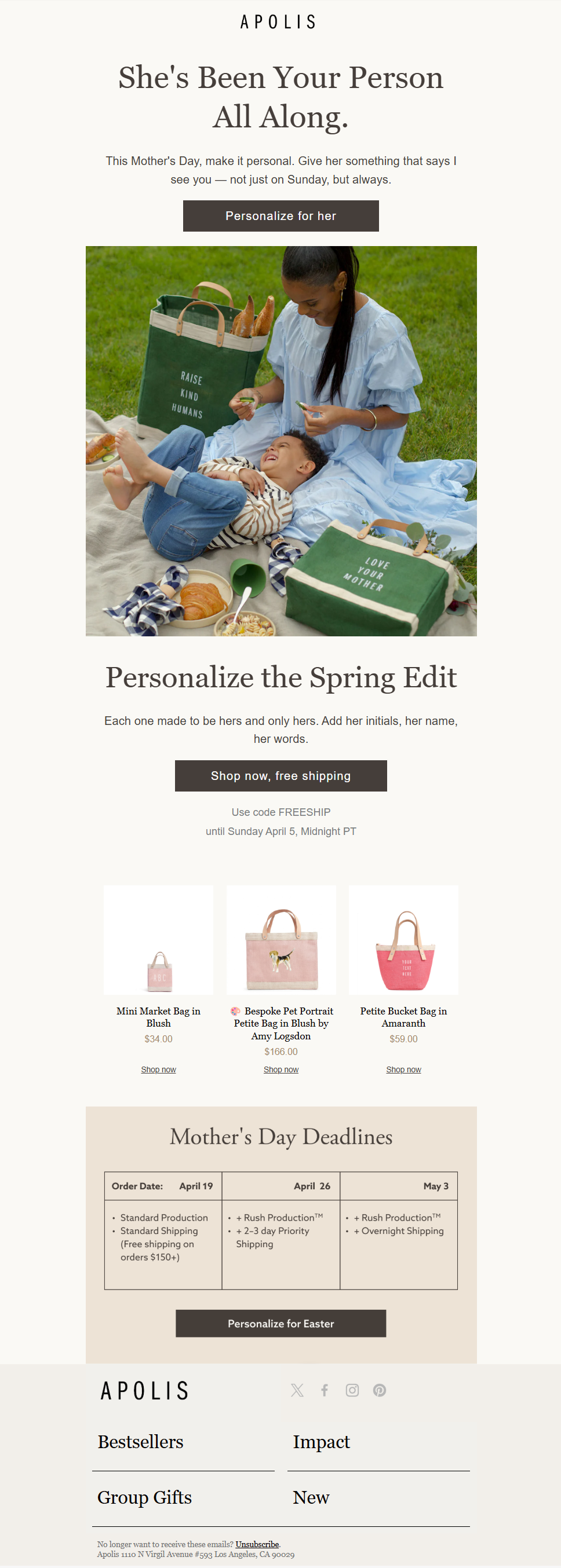
Apolis kicks off with a heartwarming headline. The hero image captures a light moment between a mother and her child, showcasing one of the many facets of motherhood.
Beyond setting the mood, the email goes on to provide useful information to the would-be buyer. The CTAs are on-point. And perhaps most importantly, Apolis sticks to live text, so that takes care of accessibility. Apolis gets the balance between marketing and mood-setting just right.
2. Giadzy
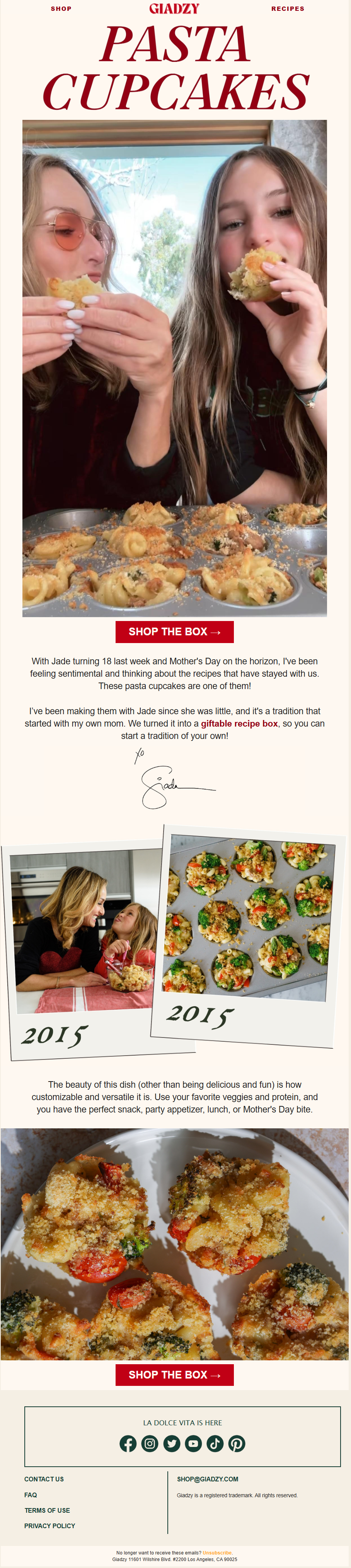
Giadzy nails their Mother’s Day email with a personal mother-daughter story. The real-life images feel like an intimate glimpse into a family album.
The message is written in live text. The economy of images is brilliant.
The CTA again is on-point and used only two times in the entire email. The journey of a mother comes off beautifully because it’s rooted in lived experiences. Any marketing material is confined to the footer, so the entire email doesn’t seem like a concocted Mother’s Day campaign.
Our favorite part? Sharing how the recipe has stayed the same while the child has grown up over the decade. This comparative bit is the soul of the email.
3. Oka-B

With a striking product shot and brilliantly-written copy that captures a mother’s nonstop routine, Oka-B delivers a focused and effective Mother’s Day email. The vibrant backdrop contrasts beautifully with the sandals, keeping the attention exactly where it should be. The headline and supporting copy feel effortless, tying the product’s utility to a mother’s everyday reality.
However, the email is entirely image-based. This approach creates an accessibility gap; if images don’t load, the message and its emotional nuance risk being completely lost.
4. Branch
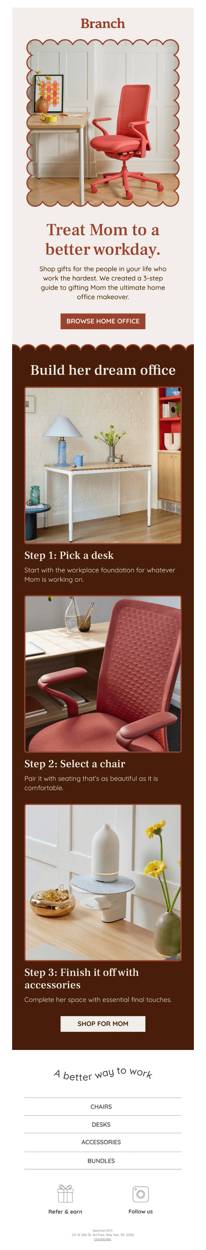
What really elevates Branch’s email is the balance between inspiration and utility.
To begin with, the design is cohesive and warm. The earthy color palette, soft backgrounds, and rounded frames create a calm, home-like feel that aligns perfectly with the theme. Each image is styled to feel aspirational yet attainable, reinforcing the idea of a thoughtfully designed space.
The use of whitespace and clear section breaks keeps everything scannable, while consistent typography ensures hierarchy without clutter. The CTAs are well-placed and purposeful.
5. Collin Street Bakery
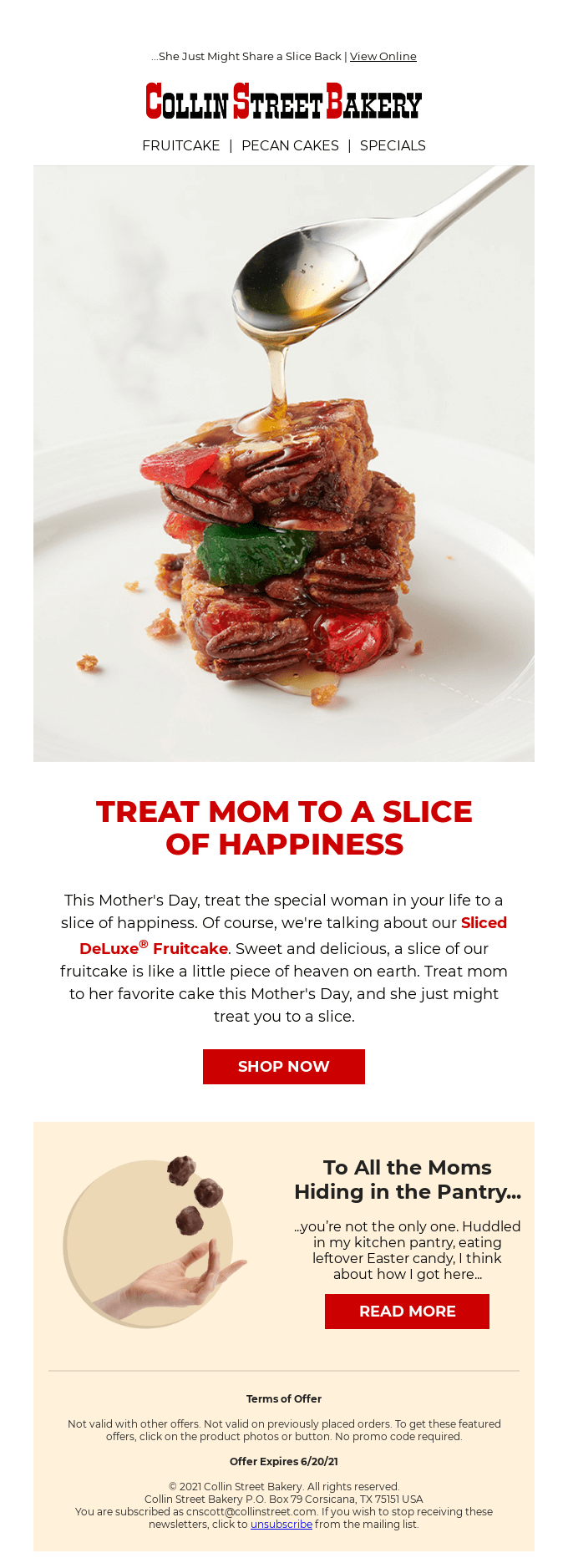
This email succeeds by leaning into indulgence, simplicity, and a strong visual hook. Right at the top, the hero image does all the heavy lifting. The close-up of syrup cascading over the fruitcake instantly appeals to the senses. And the headline builds directly on that visual.
The layout is clean and focused. There’s a clear visual hierarchy:
- Hero image to grab attention
- Bold headline to anchor the message
- Short, persuasive body copy to build desire
- A prominent CTA to drive action
The copy complements the design well. The latter half of the email introduces a relatable, slightly playful narrative, capitalizing on the human moment we talked about.
6. Dunkin Donuts
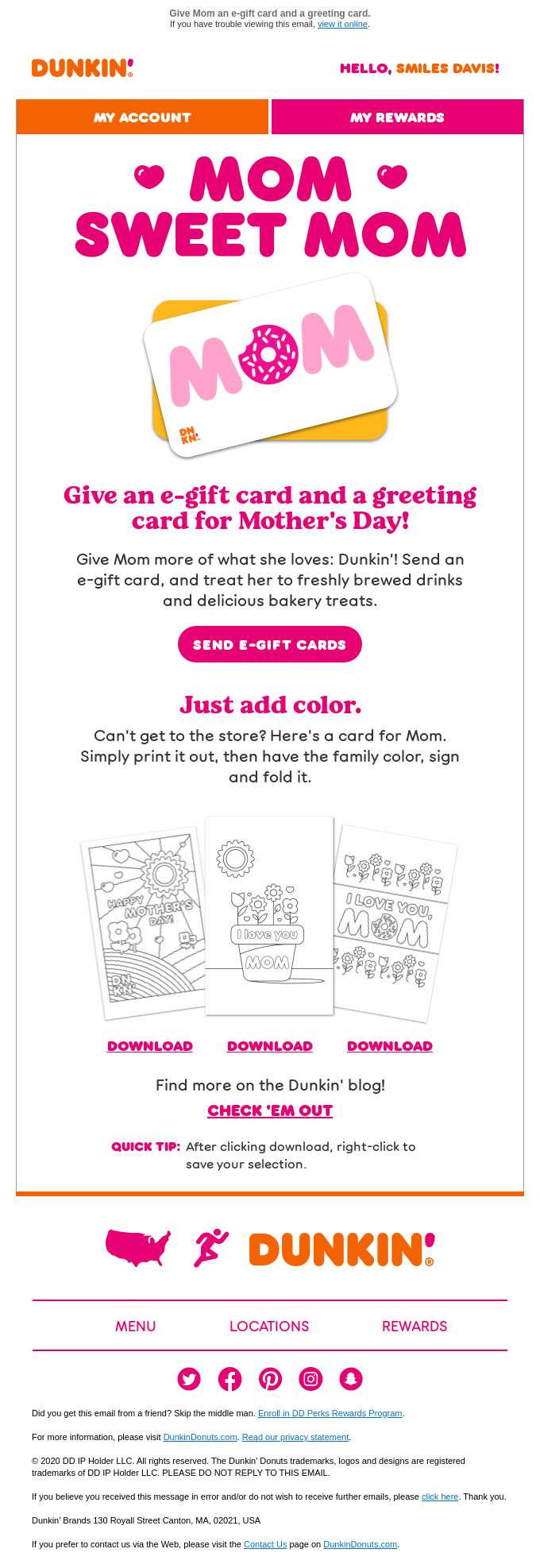
This Mother’s Day email fully embraces brand personality while keeping the experience playful, clear, and action-oriented. The typography is oversized, colorful, and unmistakably on-brand. The structure is simple but effective. It leads with the primary goal and supports it with a clear CTA.
The messaging is straightforward and benefit-driven.
Visually, the email maintains strong consistency:
- The pink and orange palette keeps everything energetic
- Rounded buttons and soft shapes create a friendly, approachable feel
- Clean spacing ensures each section is easy to scan
The multiple CTAs are well-balanced. The primary action is clear, while the secondary actions are neatly layered, with none of them competing for the viewer’s attention.
7. Velocity

True to its target audience, Velocity’s email stands out by boldly rejecting typical Mother’s Day tropes, opening with a striking visual of a pink Bronco.
The headline sets the tone. It’s confident, disruptive, evoking the so-called “boss mom.”
Structurally, Velocity’s Mother’s Day email is tight:
- A bold hero to hook attention
- A dark, high-contrast section to deliver the narrative
- A clean product showcase to close the deal
The transition from storytelling to product details feels seamless. The minimalist setting keeps the focus on the product. Nothing feels rushed, which suits the premium positioning.
8. Trade Coffee
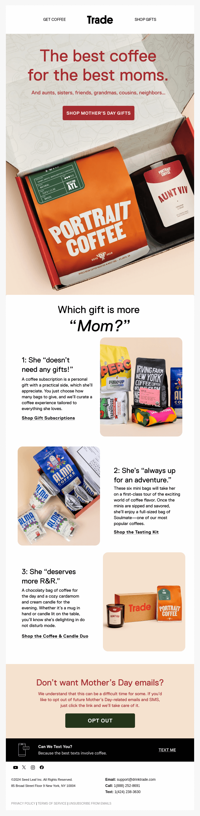
Here is a great example of how you can “narrativize” the product grid. The modular structure is highly effective, breaking the content into three relatable mom personas.
Including the opt-out within the same email is a very intelligent way to do it.
Like we said before, you can position the opt-out choice as a UI preference. That’s exactly what Trade Coffee has done, albeit you could very well do without the copy alongside. Sending a separate opt-out email is also a waste of resources. A dedicated email about an email often adds to the very noise it claims to alleviate. But of course, we’re not dogmatically against it.
Apart from these, the email excels through a clean, conversion-focused design that combines emotional appeal with a visual hierarchy that’s anchored in the Z-shaped pattern.
9. Magnetic Me
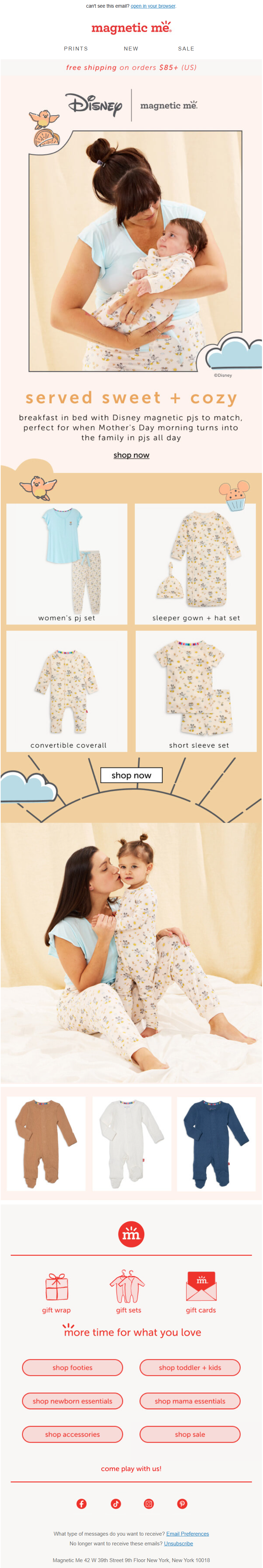
This email succeeds by leaning into a clean, product-first design that keeps the focus on visual appeal and ease of browsing. The hero image immediately establishes a soft, lifestyle-driven tone that aligns well with the brand’s audience, while the neutral color palette creates a calm and premium feel. The baby aesthetic is minimalist and soft on the eyes.
Combined with ample whitespace and a mobile-friendly stacking layout, Magnetic’s email delivers a smooth, frictionless browsing experience. A couple of hiccups, however:
- We would redesign the CTA buttons; they seem to be eclipsed owing to the font size.
- All the important links are embedded; if images are blocked by default, they will disappear, leaving only the footer visible (and readable to screen-readers).
10. Seasons 52

This email excels through a refined, brand-consistent design that combines appetizing visuals with a clear, celebratory narrative. The hero section immediately captures attention with high-quality food imagery paired with a fresh, spring-inspired color palette that aligns perfectly with the Mother’s Day theme.
The layout sticks to a strong structure and flow by means of well-defined content blocks that cater to different user interests, whether it’s dining in, bringing kids, or celebrating at home.
The hand-drawn, brush-style font also reinforces the mood of the moment.
Additionally, the generous letter spacing and soft curves improve legibility despite the stylization.
11. Dress for Less
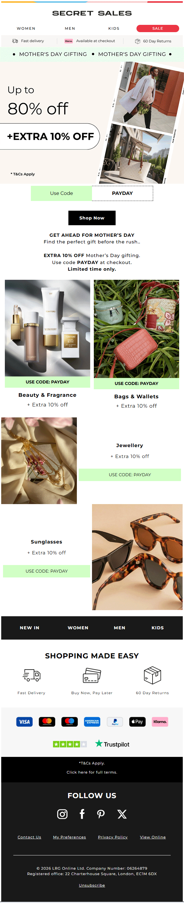
This email performs strongly by combining a bold promotional hook with a clean, retail-focused layout. The subtle GIF confined to one half of the hero section, paired with the discount offer on the other, is a very clean way of introducing animation.
Another strength is the asymmetrical grid composition. The design alternates between full-width images, split layouts, and offset text placements.
The email also subtly optimizes for multi-entry engagement.
There isn’t a single dominant CTA; instead, nearly every section is independently actionable. As a result, users can enter the funnel at any point without needing to return to the top.
Get your Mother’s Day emails designed by Email Mavlers!
As inboxes get more crowded, it’s clarity of thinking that sets high-performing campaigns apart.
If you’re looking to turn your next Mother’s Day email into a meaningful, conversion-driven experience, it starts with getting the fundamentals right and then elevating them with design and storytelling that truly resonate with your audience.
Sitting on a brief that isn’t quite there yet?
If you need a team that can take a half-formed idea and turn it into a finished product for Mother’s Day email marketing, we’re just the peeps you need. Let’s get started!