


Spring sale emails usually compete on aesthetics first. But in this roundup, we’re looking at seven spring email templates that understand visual hierarchy, pacing, merchandising, and restraint.
Some lean editorial. Some lean playful. Most interestingly, some barely acknowledge spring at all.
So here are 7 spring email designs from 7 brands that stood out to us.
7 examples of Spring sale email design
1. Sips By
Subject line: Put a spring in your sip 🌷
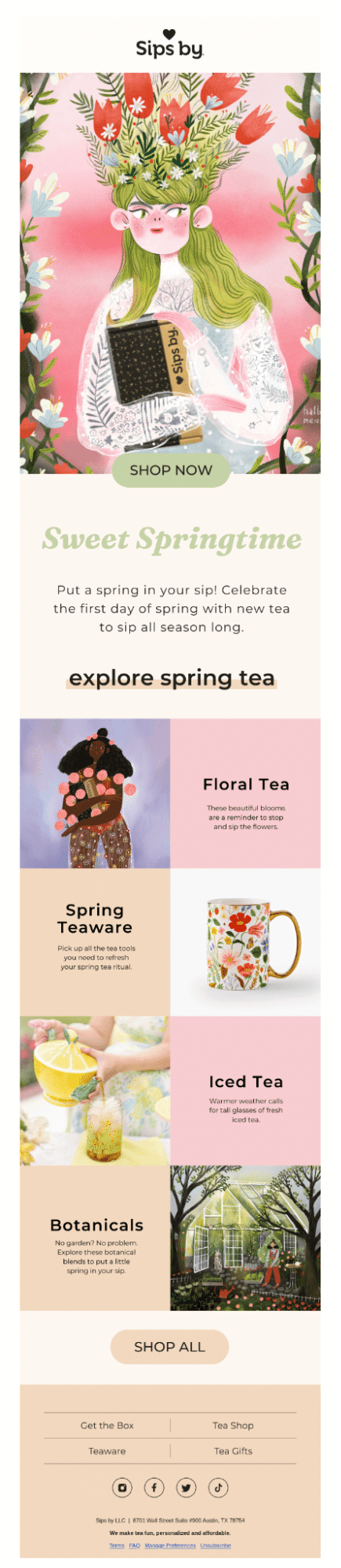
Sips By kicks off with a powerful spring email subject line. The opening hero feels closer to a book cover; the oversized illustration earns its space. There’s enough detail to keep the eye moving, but the soft edges and washed textures stop it from becoming visually noisy.
Below are a few things that stood out to us:
- The muted pistachio CTA works particularly well because it doesn’t try to overpower the artwork. The alternating product grid is handled with restraint.
- There’s also a noticeable confidence in the spacing. Large padded sections, especially around headlines and CTAs, give the artwork room to breathe.
- Another strong detail is how the photography and illustrations coexist. The floral motifs, greenhouse artwork, and product photography seem to come together naturally.
Pro tip: Consider adding micro-CTAs in the category blocks to give subscribers more entry points to act without committing to a Shop All. Ensure these CTAs redirect to the relevant product.
2. Post Familiar
Subject line: All New Wines
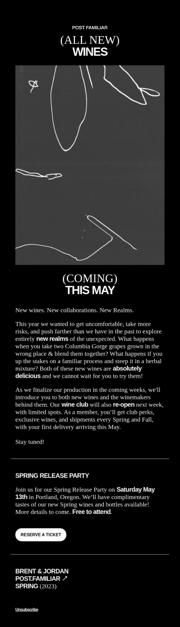
This next email from Post Familiar takes a restrained approach, preferring brand aesthetics to seasonal overtures. Here’s what stood out to us in their spring sale email design:
- The layout understands pacing. Large blocks of negative space slow the scroll down.
- The long-form copy benefits from the minimalist vibe. With fewer competing elements, the reader’s attention settles into the story behind the wines and collaborations.
- The single-column layout works particularly well here because the generous spacing and oversized typography maintain readability.
- The CTA placement is notably disciplined. The email waits until the event section to offer a clear action, which makes the reservation button feel more consequential.
Pro tip: Seasonal campaigns tend to drift into visual excesses very quickly. And what makes this email effective is that spring is treated as the context, nothing more.
If you do newsletters, you can take a cue from PF for a spring newsletter template.
3. Baggu
Subject line: The Spring Collection is Here

Baggu drops dozens of patterns a year, but the bunny prints consistently become some of their most sought-after and viral products. Naturally, the bunnies continue in their emails too.
Below are some of the things from their spring email design that stood out to us:
- The oversized wordmark at the top acts as both branding and layout structure. It anchors the entire composition early, which is especially effective in a visually minimal email.
- Product photography carries a consistent studio treatment throughout the campaign. The neutral backgrounds allow the saturated product colors and textures to really pop.
- The grid layout works well from a merchandising perspective because it mimics browsing behavior observed in e-commerce collections.
- The green CTA buttons create a strong visual contrast against the neutral palette, making the call to action stand out mid-scrolling.
Pro tip: Use seasonal styling to enhance product discovery. This email keeps the focus on shape, texture, and color variation, which makes browsing feel effortless even as the campaign leans into a playful spring mood.
4. Comrad
Subject line: A Lil’ Sale For You 🌷

This email from Comrad approaches their seasonal promotion with an upbeat retail rhythm. The design keeps the experience energetic and product-led. Here’s what stands out:
- Importantly, the hero section communicates the offer immediately. The discount, promo code, and CTA appear within a single viewing frame.
- The photography does most of the selling here. Critically, the socks are shown in styled environments that emphasize their color, texture, and wearability.
- The CTA buttons are visually consistent across the email. In fact, the image-headline-CTA structure improves scanability.
- The typography hierarchy is straightforward and efficient.
- The navigation bar at the top is useful. Subscribers who are not interested in the featured products can immediately go to the product pages.
- We’re also loving the color blocking technique. On a long scroll, these blocks act as visual checkpoints that help subscribers stay oriented throughout the email.
Pro tip: Use color blocking to create navigational structure, not just visual variety. When each background shift signals a new category, collection, or shopping intent, subscribers can scan long promotional emails much faster without feeling lost in a long-winded scroll.
As far as using emojis in spring email subject lines is concerned, limit them to just one if you must add an emoji. Resist adding emojis just to beautify the subject line.
5. Public Pool
Subject line: Spring Sale 20% Off Towels
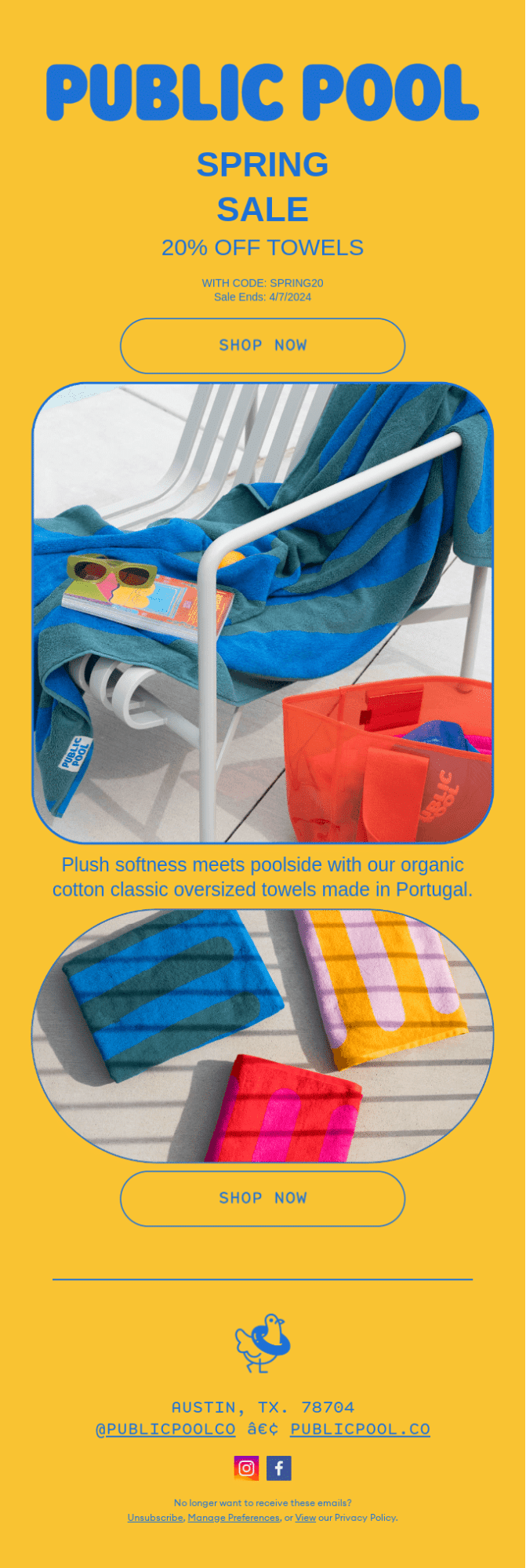
This email from Public Pool is a nice ensemble of shapes. The layout is extremely focused: one product category, one offer, and a very controlled visual system. A couple of things:
- The campaign uses only one dominant palette across the entire email, which strengthens brand recall significantly. The yellow-and-blue pairing sticks.
- The rounded image containers soften the visual density of large photography blocks. Without them, the heavy color saturation and oversized images could have made the scroll feel visually exhausting.
Pro tip: Leverage minimalism to sharpen product focus, not just to simplify the layout. This email limits copy, categories, and visual interruptions to keep attention locked on the product/offer.
6. Floyd
Subject line: A Bedroom Refresh: Just In Time Spring
Subject line: A Bedroom Refresh: Just In Time Spring

Floyd’s email approaches their spring email design with a restrained editorial confidence. The design keeps the experience premium and product-led. Here’s what stands out:
- The hero commits to one job only: establishing the sale. There’s no secondary message competing for attention. The headline, offer, and CTA are resolved within a single viewport, so the subscriber’s next action is never ambiguous.
- The product section is built on a Z-pattern layout. The subscriber’s gaze naturally travels in a Z across each block, landing on the CTA at the end of every horizontal sweep.
- The use of live text is significant in terms of deliverability and accessibility. Live text is indexable, scalable, and renders even when images are blocked.
- The product photography is shot consistently in natural light with a warm, muted palette across every image. Critically, every product is photographed in context.
Pro tip: If you must describe your products in detail, make sure to design the blocks accordingly, so that the space doesn’t feel cluttered. Just like Floyd does it in their email.
7. Starbucks
Subject line: Spring flavors are here 💐

Starbucks’ spring sale email design leans into bold visual storytelling to turn a seasonal menu launch into an event. Here’s what we think stands out in their email:
- The hero heading, split across the hero image, immediately grabs your attention.
- The entire email is built inside rounded containers, from the hero section, the product grid, the secondary banner, and even the footer nav bar. The email thus lands softly on the eye.
- The background lilac bleeds into the lilac within the template, making it visually cohesive. The cream/beige background on the product grid section creates a tonal shift from the lilac hero, giving the email a natural second act in which the viewer plays the leading role.
- We like how Starbucks doesn’t run away with the aesthetic of this email; as you can see, their brand color bookends the template.
Pro tip: If you’re unsure which aesthetic direction to take, borrow from the products. It gives the email a more cohesive identity while keeping the focus locked on what you’re selling.

Get started with spring email marketing with us!
Across all these examples, the strongest patterns remain consistent: focused layouts, controlled visual systems, contextual CTAs, and merchandising that supports browsing instead of interrupting it. Some campaigns use maximalist color blocking. Others rely on whitespace and restraint. But all the brands are clear where to direct attention, and where to stay out of the way.
As you plan your own spring campaigns, functional aesthetics is what you want to focus on.
Need help with spring sale email design, or a spring newsletter template? Let’s get started!

Susmit Panda - Content writer
